|
Getting your Trinity Audio player ready...
|
Introduction
In the world of web development, creating an intuitive and user-friendly navigation system is paramount. One of the most commonly used navigation elements is the HTML dropdown menu, which provides users with a list of options to choose from when they interact with it. In this article, we will delve into the intricacies of creating an HTML dropdown menu, step-by-step, with detailed code examples for each stage of the process.
What is an HTML Dropdown Menu?

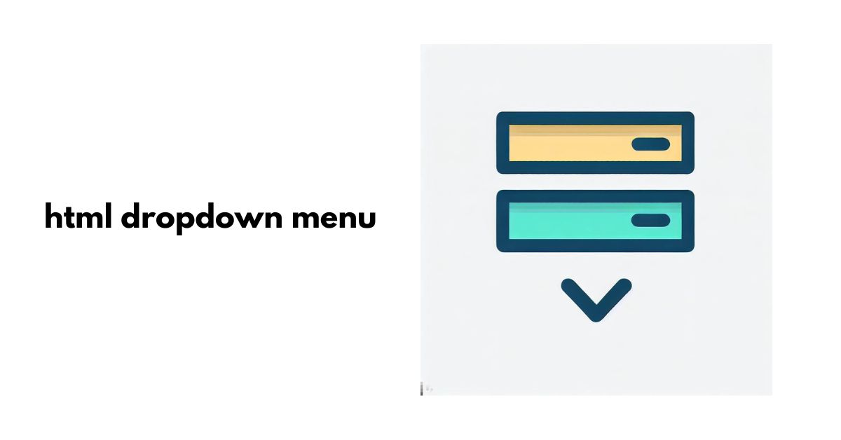
An HTML dropdown menu, also known as a select menu or drop-down list, is an interface element that allows users to pick from a pre-defined list of options. When users click on the dropdown button, a list of choices “drops down” for them to select. Dropdown menus are used for various purposes, such as selecting categories, filtering search results, or choosing preferences.
How to Create an HTML Dropdown Menu
Step 1: Set Up the HTML Structure
To begin, create a simple HTML structure for the dropdown menu using the <select> element along with <option> elements to define the available choices. Each <option> represents an item in the dropdown list, and its value attribute holds the value associated with the selected option. Here’s a basic example:
<select>
  <option value="option1">Option 1</option>
  <option value="option2">Option 2</option>
  <option value="option3">Option 3</option>
</select>
Step 2: Add CSS Styling
To make the dropdown visually appealing, you can apply CSS styles to customize its appearance. You can modify properties like background color, font, border, and more to match your website’s design. For instance:
<style>
  /* Styling the dropdown button */
  select {
    padding: 10px;
    border: 1px solid #ccc;
    border-radius: 5px;
    background-color: #f9f9f9;
    font-size: 16px;
    color: #333;
  }

  /* Styling the dropdown items */
  option {
    background-color: #fff;
    color: #333;
  }
</style>
Step 3: Implement JavaScript Functionality (Optional)
If you want to add interactivity to your dropdown menu, you can use JavaScript. For example, you can add event handlers to perform actions when the user selects an option. Here’s a simple example using JavaScript to display an alert with the selected option:
<script>
  const dropdown = document.querySelector('select');

  dropdown.addEventListener('change', () => {
    const selectedOption = dropdown.value;
    alert(`You selected: ${selectedOption}`);
  });
</script>
Customization Options for Dropdown Menus
Changing the Dropdown Position
By default, dropdown menus appear below the dropdown button. However, you can adjust the position using CSS. For example, to make the dropdown appear above the button:
<style>
  /* Position the dropdown above the button */
  select {
    position: absolute;
    bottom: 100%;
  }
</style>
Adjusting Dropdown Width
You can set a fixed width for the dropdown menu or allow it to expand based on the content. Consider the content length and your website’s design when deciding on the width:
<style>
  /* Fixed width for the dropdown menu */
  select {
    width: 200px;
  }

  /* Allow the dropdown to expand with content */
  select {
    width: auto;
  }
</style>
Styling the Dropdown Button
Make the dropdown button visually appealing to attract user attention. Apply CSS styles to customize its appearance:
<style>
  /* Styling the dropdown button */
  select {
    padding: 10px;
    background-color: #4CAF50;
    color: white;
    border: none;
    border-radius: 5px;
    font-size: 16px;
  }
</style>
Adding Hover Effects
To enhance interactivity, add hover effects that change the appearance of the dropdown button or items when the user hovers over them:
<style>
  /* Hover effect for the dropdown button */
  select:hover {
    background-color: #45a049;
  }

  /* Hover effect for dropdown items */
  option:hover {
    background-color: #f2f2f2;
  }
</style>
Best Practices for Usability and Accessibility
Keeping Dropdowns Simple and Intuitive
Avoid overwhelming users with too many options. Keep the dropdown menus simple and well-organized for an intuitive user experience.
Ensuring Keyboard Navigation Support
Ensure your dropdown menus are accessible via keyboard navigation. Users should be able to interact with the dropdown and select options using only the keyboard:
<select tabindex="0">
  <!-- Options here -->
</select>
Adding ARIA Attributes
Use ARIA attributes to enhance the accessibility of your dropdown menus, making it easier for screen readers and assistive technologies to interpret the content:
<select aria-label="Choose an option">
  <!-- Options here -->
</select>
Testing for Cross-Browser Compatibility
Different browsers may render dropdown menus differently. Perform thorough testing to ensure compatibility across popular web browsers.
Advanced Dropdown Menu Techniques
Creating Nested Dropdowns
Nested dropdowns allow you to organize options into categories or subcategories, providing a more organized user experience. To create a nested dropdown, nest <optgroup> elements inside the main <select> element:
<select>
  <optgroup label="Fruits">
    <option value="apple">Apple</option>
    <option value="orange">Orange</option>
  </optgroup>
  <optgroup label="Vegetables">
    <option value="carrot">Carrot</option>
    <option value="broccoli">Broccoli</option>
  </optgroup>
</select>
Using Images and Icons
To make the dropdown more visually appealing and help users recognize options, you can include images or icons:
<select>
  <option value="apple">🍎 Apple</option>
  <option value="orange">🍊 Orange</option>
  <option value="carrot">🥕 Carrot</option>
</select>
Employing Transitions and Animations
Add smooth transitions and animations to the dropdown to make it feel more interactive and engaging:
<style>
  /* Apply a fade-in animation to the dropdown */
  @keyframes fadeIn {
    from { opacity: 0; }
    to { opacity: 1; }
  }

  select {
    animation: fadeIn 0.5s;
  }
</style>
Troubleshooting Common Issues
Dropdowns Not Displaying Correctly
If the dropdown is not appearing as expected, check your CSS and JavaScript code for any errors or conflicting styles.
Dropdowns Not Working on Mobile Devices
Ensure that your dropdown menus are mobile-friendly and that users on small-screen devices can access and use them without issues.
Z-Index and Layering Problems
If the dropdown is being hidden behind other elements on the page, adjust the z-index and layering to bring it to the front.
Conclusion
In conclusion, HTML dropdown menus are essential components in modern web development that significantly improve website navigation and user experience. By following the steps outlined in this comprehensive guide and utilizing the provided code examples, you can easily create interactive and visually appealing dropdown menus that seamlessly blend into your website’s design.
FAQs
- Q: Can I use images in my dropdown menu?
A: Yes, you can incorporate images or icons to make your dropdown menu more visually appealing. - Q: How do I create a dropdown with multiple levels of nested options?
A: To create nested dropdowns, simply nest<optgroup>elements inside the main<select>element. - Q: Are dropdown menus accessible for users with disabilities?
A: Yes, by following best practices and adding ARIA attributes, you can make your dropdown menus more accessible to all users. - Q: Can I use animations for the dropdown appearance?
A: Absolutely! You can employ CSS transitions and animations to create a smoother and more engaging dropdown experience. - Q: What if my dropdown menu is not displaying correctly on mobile devices?
A: Make sure to implement mobile-friendly design and test your dropdown menus on various devices to ensure compatibility.

Arsalan Malik is a passionate Software Engineer and the Founder of Makemychance.com. A proud CDAC-qualified developer, Arsalan specializes in full-stack web development, with expertise in technologies like Node.js, PHP, WordPress, React, and modern CSS frameworks.
He actively shares his knowledge and insights with the developer community on platforms like Dev.to and engages with professionals worldwide through LinkedIn.
Arsalan believes in building real-world projects that not only solve problems but also educate and empower users. His mission is to make technology simple, accessible, and impactful for everyone.
Join us on dev community