|
Getting your Trinity Audio player ready...
|
Setting Up React Select
Installing React Select is simple. Open your terminal and enter one command. For npm, run:
<code>npm install react-select</code>Or if Yarn is your preference:
<code>yarn add react-select</code>To keep your workspace organized, consider your project structure. React Select will be a component in your toolset, so creating a dedicated directory makes sense. It could look like this:
src/
|-- components/
|-- SelectComponents/
|-- CustomSelect.js
|-- styles.js
|-- App.js
In CustomSelect.js, import React Select and start configuring:
import React from 'react';
import Select from 'react-select';
import { customStyles } from './styles';

export default function CustomSelect({ options, onChange, value }) {
  return (
    <Select
      options={options}
      value={value}
      onChange={onChange}
      styles={customStyles}
    />
  );
}
In styles.js, you can customize the appearance using React Select’s styling API:
export const customStyles = {
control: (provided) => ({
...provided,
backgroundColor: 'navy',
color: 'white',
padding: '10px'
}),
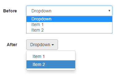
option: (styles, { isDisabled, isFocused, isSelected }) => {
return {
...styles,
backgroundColor: isDisabled ? 'gray' : isSelected ? 'blue' : isFocused ? 'aliceblue' : undefined,
cursor: isDisabled ? 'not-allowed' : 'default',
};
},
};
Running your project now means you have a foundation for using React Select’s capabilities.
Implementing Custom Components
React Select’s adaptability comes from its Component Injection API, which allows you to replace default components with your own creations.
For example, if you need to design a dropdown that wraps each option in a unique style, you would start by creating a new component that defines the behavior of each dropdown option:
import React from 'react';
import { components } from 'react-select';

const GlowOption = ({ children, ...props }) => {
  const style = {
    ...props.getStyles('option', props),
    cursor: 'pointer',
    backgroundColor: props.isFocused ? 'gold' : 'lightgrey',
    color: props.isSelected ? 'white' : 'black',
    padding: 20,
  };

  return (
    <components.Option {...props} style={style}>
      {children}
    </components.Option>
  );
};
Next, integrate this new component with your select component in CustomSelect.js:
import React from 'react';
import Select, { components } from 'react-select';
import { customStyles } from './styles';

export default function CustomSelect({ options, onChange, value }) {
  return (
    <Select
      options={options}
      value={value}
      onChange={onChange}
      styles={customStyles}
      components={{ Option: GlowOption }}
    />
  );
}
React Select’s Styling API allows you to dive deeper into aesthetics, crafting components that are uniquely yours.
Handling Data with Async Components
To fetch options for dropdowns from external APIs, use React Select’s Async components. The AsyncSelect component handles data-fetching internally before rendering refined UI elements based on the results.
Import the component:
<code>import AsyncSelect from 'react-select/async';</code>To feed your dropdown live options from the server, set the loadOptions prop:
const loadOptions = inputValue =>
  fetch(`https://api.example.com/options?query=${inputValue}`)
    .then(res => res.json())
    .then(res => res.map(option => ({ value: option.id, label: option.name })));

<AsyncSelect
  cacheOptions
  loadOptions={loadOptions}
  defaultOptions />
This instructs AsyncSelect to call loadOptions as user input changes. cacheOptions ensures previously loaded options are cached to speed up future loads. Setting defaultOptions initiates an upfront load, populating options even before user interaction.
For more advanced scenarios, such as allowing users to create options via custom values entered in real-time, combine CreatableSelect with AsyncSelect:
import CreatableSelect from 'react-select/creatable';
import AsyncCreatableSelect from 'react-select/async-creatable';

const mixtureLoader = inputValue => {/* similar to loadOptions function */};

<AsyncCreatableSelect
  isMulti
  cacheOptions
  loadOptions={mixtureLoader}
  defaultOptions />
This enables users to create entries on the fly that aren’t in the fetched list, adding those new options to the mix.
Connecting async operations using AsyncSelect or synergizing it with creations using AsyncCreatableSelect unleashes the dynamism of React Select. Leverage these utilities and be ready for whatever user data interactions come your way.
React Testing Library/User-Event: A Comprehensive Guide
Writio: Your AI content writer for blogs and websites. This page was magically crafted by Writio

Arsalan Malik is a passionate Software Engineer and the Founder of Makemychance.com. A proud CDAC-qualified developer, Arsalan specializes in full-stack web development, with expertise in technologies like Node.js, PHP, WordPress, React, and modern CSS frameworks.
He actively shares his knowledge and insights with the developer community on platforms like Dev.to and engages with professionals worldwide through LinkedIn.
Arsalan believes in building real-world projects that not only solve problems but also educate and empower users. His mission is to make technology simple, accessible, and impactful for everyone.
Join us on dev community