|
Getting your Trinity Audio player ready...
|
Are you looking to add cool animations to your website using CSS? look no further! In this article, we’ll explore the exciting world of CSS multiple animations and provide practical code examples to help you bring your web pages to life.
Whether you’re a beginner or an experienced web developer, this guide will equip you with the knowledge and skills to create stunning animations that will mesmerize your audience. So, let’s dive in and unleash the power of CSS animations!

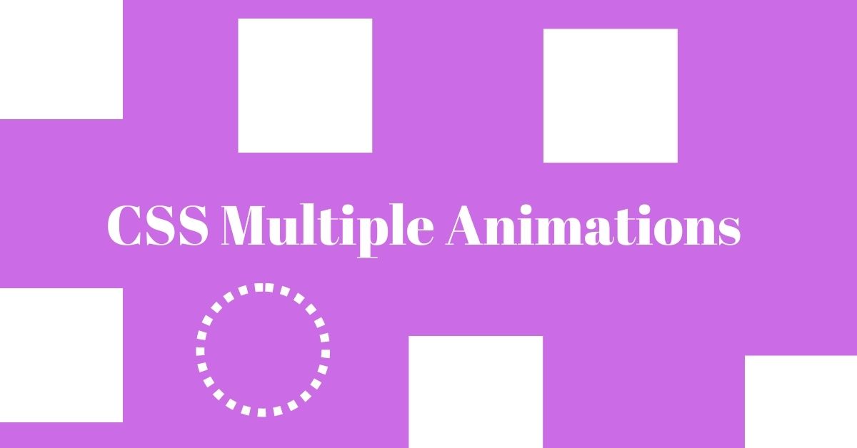
1. Introduction to CSS Animations
CSS animations enable you to add movement and interactivity to your web pages without relying on JavaScript or other external libraries. They allow you to create engaging user experiences by animating various elements such as text, images, buttons, and more. With CSS animations, you can bring dynamism and visual appeal to your website, enhancing its overall look and feel.
2. Understanding Multiple Animations
Multiple animations in CSS refer to the simultaneous execution of two or more animations on a single element. By combining different animation properties, you can create complex and intricate effects that are sure to grab your visitors’ attention. With multiple animations, you have the flexibility to control the timing, duration, and order of each animation, resulting in unique and captivating visual effects.
3. Setting up the HTML Structure
Before diving into the CSS code, let’s set up the HTML structure that will serve as the foundation for our animations. Here’s a basic example:
<div class="animation-container">
  <div class="animated-element">Hello, World!</div>
</div>
In this example, we have a container div with a child element that we want to animate. Feel free to modify the HTML structure based on your specific needs and design requirements.
4. CSS Keyframes for Multiple Animations
CSS keyframes define the intermediate steps of animation, allowing you to specify different styles at various points in time. To create multiple animations, we need to define multiple sets of keyframes. Here’s an example:
@keyframes slide {
  0% {
    transform: translateX(0);
  }
  50% {
    transform: translateX(100px);
  }
  100% {
    transform: translateX(0);
  }
}

@keyframes fade {
  0% {
    opacity: 1;
  }
  100% {
    opacity: 0;
  }
}
In this code snippet, we define two sets of keyframes: slide and fade. The slide keyframes move the element horizontally, while the fade keyframes control its opacity. Feel free to experiment and create your own keyframes based on the desired animation effects.
5. Applying Multiple Animations to Elements
Now that we have our keyframes defined, let’s apply the animations to our HTML elements. We can use the animation property in CSS to achieve this. Here’s an example:
.animated-element {
  animation: slide 2s infinite, fade 1s infinite alternate;
}
In this code snippet, we apply the slide animation for 2 seconds in an infinite loop and the fade animation for 1 second, also in an infinite loop. The alternate keyword makes the fade animation play in reverse on every other cycle. Feel free to adjust the animation properties based on your requirements.
6. Adjusting Animation Duration and Timing
To control the duration and timing of our animations, we can use the animation-duration and animation-timing-function properties. Here’s an example:
.animated-element {
  animation: slide 2s ease-in-out, fade 1s infinite alternate;
}
In this modified code snippet, we set the duration of the slide animation to 2 seconds and use the ease-in-out timing function. The ease-in-out function creates a smooth acceleration and deceleration effect, providing a more natural animation experience. Feel free to explore different timing functions and durations to achieve the desired animation effect.
7. Creating Sequential Animations
Sequential animations are animations that play one after the other. To create sequential animations, we can use the animation-delay property. Here’s an example:
.animated-element {
  animation: slide 2s infinite, fade 1s infinite alternate;
  animation-delay: 1s;
}
In this modified code snippet, we introduce a 1-second delay before starting the animation sequence. This delay creates a pause between the slide and fade animations, resulting in a smooth transition between the two effects. Experiment with different delay values to achieve the desired sequential animation effect.
8. Controlling Animation Delay
The animation-delay property also allows us to control the delay before an animation starts. By manipulating this property, we can create visually appealing effects. Here’s an example:
.animated-element {
  animation: slide 2s infinite, fade 1s infinite alternate;
  animation-delay: 0.5s;
}
In this modified code snippet, we reduce the animation delay to 0.5 seconds. As a result, the slide and fade animations start slightly earlier, creating a sense of anticipation and enhancing the overall visual impact. Play around with different delay values to find the perfect timing for your animations.
9. Pausing and Resuming Animations
Sometimes, you may need to pause or resume animations based on user interactions or specific events. CSS provides the animation-play-state property to control the playback of animations. Here’s an example:
.animated-element {
  animation: slide 2s infinite, fade 1s infinite alternate;
  animation-play-state: paused;
}

.animated-element:hover {
  animation-play-state: running;
}
In this code snippet, we initially set the animation’s play state to “paused.” However, when the user hovers over the element, we change the play state to “running,” allowing the animation to resume. This technique gives you the flexibility to control animations based on user actions, providing a more interactive and engaging user experience.
10. Animation Iteration and Direction
The animation-iteration-count and animation-direction properties allow you to control the number of times an animation plays and the direction of the animation, respectively. Here’s an example:
.animated-element {
  animation: slide 2s infinite, fade 1s infinite alternate;
  animation

-iteration-count: 3;
  animation-direction: alternate-reverse;
}
In this code snippet, the slide and fade animations play in an infinite loop but only repeat three times. Additionally, the animation-direction property is set to “alternate-reverse,” which means the animations play in reverse every other iteration. Feel free to experiment with different iteration counts and directions to achieve the desired animation behavior.
11. Combining Multiple Animations
To create complex animations, you can combine multiple animation properties and keyframes. By leveraging CSS’s flexibility, you can achieve impressive effects. Here’s an example:
.animated-element {
  animation: slide 2s infinite, fade 1s infinite alternate, rotate 3s linear;
}

@keyframes rotate {
  0% {
    transform: rotate(0deg);
  }
  100% {
    transform: rotate(360deg);
  }
}
In this code snippet, we introduce a new rotate animation that continuously rotates the element by 360 degrees. By combining multiple animations, you can create dynamic and visually appealing effects that elevate your website’s aesthetics.
12. Cross-browser Compatibility
When working with CSS animations, it’s essential to consider cross-browser compatibility. Not all browsers interpret CSS animations in the same way, so it’s crucial to test your animations across different browsers and versions. To ensure compatibility, consider using vendor prefixes and testing your animations on popular browsers such as Chrome, Firefox, and Safari.
13. Best Practices for Using Multiple Animations
To make the most of CSS multiple animations, keep these best practices in mind:
- Start with a clear plan and design concept before implementing animations.
- Keep your animations subtle and relevant to avoid overwhelming your audience.
- Optimize your animations for performance by minimizing the use of heavy effects.
- Test your animations on multiple devices and screen sizes to ensure responsiveness.
- Experiment with different animation combinations to create unique visual experiences.
14. Troubleshooting Common Animation Issues
While working with CSS animations, you might encounter some common issues. Here are a few troubleshooting tips to help you overcome them:
- Check for any conflicting styles or CSS properties that might interfere with your animations.
- Verify that you’ve defined the correct keyframes and animation names.
- Ensure that you’re using the correct syntax and property values for your animations.
- Test your animations on different browsers and devices to identify any compatibility issues.
15. Conclusion
CSS multiple animations offer a powerful toolset for creating captivating and dynamic web experiences. By leveraging keyframes, animation properties, and sequencing techniques, you can bring your designs to life and engage your audience in unique ways. Remember to experiment, test, and refine your animations to achieve the desired effect. Now, go ahead and unleash your creativity by implementing stunning CSS multiple animations on your web projects!
FAQs
- Can CSS animations be combined with JavaScript interactions?
Yes, CSS animations can be seamlessly combined with JavaScript interactions to create more advanced and interactive effects. By manipulating CSS classes or properties through JavaScript, you can dynamically control animations based on user actions or specific events. - Are CSS animations supported on all web browsers?
While CSS animations are widely supported by modern web browsers, some older versions might have limited support or require vendor prefixes. It’s essential to test your animations across different browsers and versions to ensure a consistent experience for all users. - Can I use CSS animations in responsive web design?
Absolutely! CSS animations can be used in responsive web design to enhance the visual appeal and interactivity of your website across various devices and screen sizes. Ensure that your animations adapt gracefully to different viewports and provide an optimal user experience. - Are there any performance considerations when using multiple CSS animations?
Yes, performance is a crucial aspect when using multiple CSS animations. To optimize performance, avoid using excessive animations or heavy effects that may cause your website to become slow or unresponsive. Test your animations on different devices and optimize them for smooth performance. - Where can I find more CSS animation resources and inspiration?
There are numerous online resources and websites dedicated to CSS animations. Some popular sources include CSS animation tutorials, code snippets, and design inspiration websites. Explore platforms like CodePen, CSS-Tricks, and Dribbble to find inspiration and learn new animation techniques.
What Is CSS Writing Mode: A Complete Guide
Horizontal Timeline CSS Responsive -Guide

Arsalan Malik is a passionate Software Engineer and the Founder of Makemychance.com. A proud CDAC-qualified developer, Arsalan specializes in full-stack web development, with expertise in technologies like Node.js, PHP, WordPress, React, and modern CSS frameworks.
He actively shares his knowledge and insights with the developer community on platforms like Dev.to and engages with professionals worldwide through LinkedIn.
Arsalan believes in building real-world projects that not only solve problems but also educate and empower users. His mission is to make technology simple, accessible, and impactful for everyone.
Join us on dev community