If you’re looking to add a timeline to your website. responsive Horizontal timeline is a great option for that. It allows you to showcase the progress of your company, organization, or personal achievements in a visually appealing way. In this article, we’ll walk you through the step-by-step process of creating a responsive horizontal timeline using CSS.
Introduction
In this digital age, websites are not just static pages with a few lines of text and some images. Websites are now interactive, with various elements that help visitors engage and stay longer on your website. A horizontal timeline is one such element that can make your website more interactive and engaging.
What is a Horizontal Timeline?
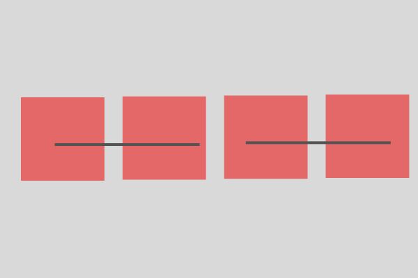
A horizontal timeline is a graphical representation of events or milestones that are displayed horizontally. It shows events in chronological order, with dates or years marked along the timeline. Horizontal timelines are widely used to display company history, product development, project milestones, or personal achievements.
Why Use a Horizontal Timeline?
A horizontal timeline can help you communicate complex information in a visually appealing way. It can also help you showcase your achievements and milestones, and build trust with your visitors. A timeline can help you tell a story, and visitors are more likely to engage with your website if they find your content interesting and informative.
Planning Your Timeline

Before you start coding your timeline, you should plan the events or milestones that you want to showcase. Make a list of all the events, and decide which events are significant enough to be included on your timeline. Once you have a list of events, you should organize them chronologically and assign dates or years to each event.
Creating the HTML Structure

To create a horizontal timeline, you’ll need to start with the HTML structure. The basic structure of a horizontal timeline consists of a container, a list of events, and markers to indicate the position of each event on the timeline.
The container is the wrapper that holds the entire timeline, and it can be a div or a section element. The list of events is a series of divs, each representing an event. The markers can be created using pseudo-elements or background images.
 <div class="timeline">
        <div class="event"></div>
        <div class="event"></div>
        <div class="event"></div>
        <div class="event"></div>
        <div class="event"></div>
 </div>
Styling the Timeline with CSS
After creating the HTML structure, it’s time to style the timeline with CSS. The first step is to set the width and height of the container and position the events on the timeline. You can use Flexbox or CSS grid to position the events.
Next, you’ll need to style the markers that indicate the position of each event. You can use pseudo-elements or background images to create the markers. You can also style the events to make them more visually appealing, such as by adding icons or images.
.timeline {
     display: flex;
     justify-content: space-between;
     align-items: center;
     height: 100px; /* Adjust the height as needed */
     background-color: #f0f0f0; /* Adjust the background color as needed */
     }

.event {
       position: relative;
       flex: 0 0 auto;
       width: 20px; /* Adjust the width as needed */
       height: 20px; /* Adjust the height as needed */
       background-color: #333; /* Adjust the marker color as needed */
       border-radius: 50%;
        }

        .event::before {
            content: '';
            position: absolute;
            width: 1px; /* Adjust the width as needed */
            height: 100%; /* Adjust the height as needed */
            background-color: #333; /* Adjust the timeline color as needed */
            left: 50%;
            top: 0;
            }
Making the Timeline Responsive
Once you’ve created a basic timeline, it’s important to make it responsive. A responsive timeline will adjust its size and layout based on the screen size of the device. To make the timeline responsive, you can use media queries to set different styles for different screen sizes.
 /* Media query for smaller screens */
        @media (max-width: 768px) {
            .timeline {
                display: grid;
                justify-content: center;
                height: auto;
            }

            .event {
                margin-bottom: 20px; /* Adjust the spacing between events */
         }
Adding Animation
Adding animation to your timeline can make it more engaging and visually appealing. You can use CSS animations or JavaScript libraries like jQuery or GSAP to add animation to your timeline. Animations can include hover effects, slide-in effects, or scroll animations.
Imagine your timeline is a little train track, with each event being a colorful train car. If you use GSAP or jQuery, you could make the cars zoom onto the track one by one when someone visits your page! You could even have the color of the cars change when someone points their mouse at them. That'd be a really fun extra touch, wouldn't it?
Now, imagine you're making a timeline of your favorite superhero's adventures. Wouldn't it be amazing if, as you scroll down the line, animations make the events move just like your hero does in the comic books? CSS animations can do just that, making your timeline a real action-packed adventure!
Testing Your Timeline

After you’ve created your timeline, it’s important to test it on different devices and browsers. You can use tools like BrowserStack or CrossBrowserTesting to test your timeline on various devices and browsers.
Testing your timeline will help you identify any issues with the layout or functionality of your timeline on different devices. You should also test your timeline for accessibility to ensure that it can be used by people with disabilities.
Common Mistakes to Avoid

When creating a responsive horizontal timeline using CSS, there are some common mistakes that you should avoid. One common mistake is using too many colors or fonts, which can make your timeline look cluttered and unprofessional. Another mistake is not making your timeline responsive, which can make it difficult for visitors to view your timeline on different devices.
You should also avoid using too much text on your timeline, as it can make your timeline look overwhelming and difficult to read. Finally, you should avoid using too many animation effects, as it can make your timeline look distracting and confusing.
Additional Customization Options
There are many ways to customize your responsive horizontal timeline using CSS. You can add icons or images to your timeline to make it more visually appealing. You can also use different colors or fonts to match your website’s branding.
Another customization option is to add tooltips or pop-ups to your timeline, which can provide additional information about each event. You can also add links to your timeline, which can direct visitors to other pages on your website or external resources.
Another Code Example
Here is an example of a responsive horizontal timeline using CSS:
HTML code:
<div class="timeline">
  <div class="timeline-item">
    <div class="timeline-content">
      <h2>Year 1</h2>
      <p>Event 1</p>
    </div>
  </div>
  <div class="timeline-item">
    <div class="timeline-content">
      <h2>Year 2</h2>
      <p>Event 2</p>
    </div>
  </div>
  <div class="timeline-item">
    <div class="timeline-content">
      <h2>Year 3</h2>
      <p>Event 3</p>
    </div>
  </div>
</div>
CSS code:
.timeline {
  display: flex;
  flex-direction: row;
  overflow-x: auto;
  white-space: nowrap;
}

.timeline-item {
  width: 300px;
  padding: 20px;
  margin-right: 20px;
  background-color: #f2f2f2;
  border-radius: 5px;
  box-shadow: 0 0 5px rgba(0, 0, 0, 0.1);
}

.timeline-content {
  text-align: center;
}

@media screen and (max-width: 768px) {
  .timeline {
    flex-direction: column;
    overflow-x: hidden;
    white-space: normal;
  }

  .timeline-item {
    margin-right: 0;
    margin-bottom: 20px;
  }
}
Explanation:
- The
.timelinecontainer is set todisplay: flexandflex-direction: rowto make the timeline items align horizontally. overflow-x: autois used to enable horizontal scrolling when the timeline items exceed the container’s width.white-space: nowrapis used to prevent the timeline items from wrapping to the next line.- The
.timeline-itemclass is used to style each timeline item. In this example, the width is set to 300px, and the margin-right is set to 20px to create space between the items. - The
.timeline-contentclass is used to center the content of each timeline item. - The
@mediarule is used to apply different styles for screens with a maximum width of 768px. In this case, the timeline is changed to a vertical layout, and the margin-right is removed from the timeline items to create space between them vertically.
Note: You may need to adjust the values of the CSS properties to fit your specific needs.
Conclusion
A responsive horizontal timeline using CSS is a great way to showcase your company’s history, product development, or personal achievements on your website. By following the step-by-step guide in this article, you can create a visually appealing and engaging timeline that will impress your visitors.
Remember to plan your events, create the HTML structure, style the timeline with CSS, make it responsive, and test it on different devices and browsers. Avoid common mistakes, and customize your timeline to match your website’s branding. With these tips, you can create a timeline that will stand out and engage your visitors.
FAQs
Can I add multiple timelines to my website?
- Yes, you can add multiple timelines to your website by creating separate HTML structures and CSS styles for each timeline.
How can I make my timeline accessible to people with disabilities?
- You can make your timeline accessible by adding alt text to images and providing alternative ways to access content, such as through keyboard navigation.
Can I use JavaScript to create my timeline?
- Yes, you can use JavaScript libraries like jQuery or GSAP to add animation or interactivity to your timeline.
What are some common mistakes to avoid when creating a timeline?
- Some common mistakes to avoid include using too many colors or fonts, not making your timeline responsive, using too much text, and using too many animation effects.
How can I customize my timeline to match my website’s branding?
- You can customize your timeline by using colors, fonts, icons, images, and pop-ups that match your website’s branding.

