|
Getting your Trinity Audio player ready... |
CSS animation libraries offer tools to enhance web design with dynamic visual effects. From simple transitions to complex interactions, these libraries provide developers with the means to bring their projects to life. Understanding how each library functions can help you choose the right one for your needs.
CSS Frameworks List and Their Pros and Cons
CSS Multiple Animations Complete Guide
The Ultimate Guide to CSS Mask Animation
Animate.css
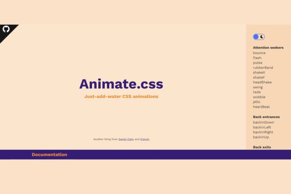
Animate.css is a widely used CSS animation library with over 76,000 stars on GitHub. It allows easy integration of animations by including class names in elements. The library is useful for:
- On-page motion
- Slider transitions
- Grabbing user attention
It includes utility classes to adjust animation duration, speed, and repetition from the markup. You can also integrate these animations with the native CSS keyframe property.
How to use: Animate.css is available as an npm package and via CDN. After adding its CDN URL in your markup head section, start calling from its list of available animations.
Example:
<head>

  <link

    rel="stylesheet"

    href="https://cdnjs.cloudflare.com/ajax/libs/animate.css/4.1.1/animate.min.css"

  />

</head>

<body>

  <div class="animate__animated animate__pulse">A pulse animated element</div>

  <div class="animate__animated animate__pulse animate__infinite">A pulse animated element</div>

</body>2. Magic Effects
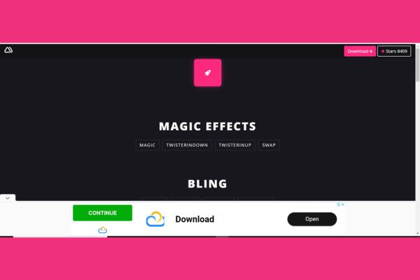
Magic CSS offers simple yet effective animations for web or app projects. These animations are suitable for page transitions and interactive elements, enhancing the user experience.
The library is built entirely in CSS, making it lightweight and efficient, which ensures better performance across various browsers (except Opera Mini). This is beneficial for mobile web projects where performance is critical.
How to use: Download Magic CSS from npm or use its CSS source file. Include the CSS file in your project for the use of the animations.
Example:
<head>

  <link rel="stylesheet" href="https://raw.githubusercontent.com/miniMAC/magic/master/dist/magic.min.css">

</head>

<body>

  <div class="magictime puffIn">Magic CSS makes elements come alive!</div>

</body>
Magic CSS provides a variety of special effects animations, including:
- swashIn
- twisterInDown
- puffIn
- vanishIn
These effects are designed to bring visual flair and draw user attention.
3. Animista
Animista is a CSS animation platform that allows you to pick and customize animations before downloading only the CSS you need. It provides a range of animations from text effects to background movements.
How to use:
- Visit Animista.
- Select an animation type.
- Customize the specifics—timing, delay, and repetition.
- Export and grab your CSS code.
Example of generated CSS for a bounce animation:
@keyframes bounce {

  0%, 100% {

    transform: translateY(0);

  }

  50% {

    transform: translateY(-30px);

  }

}

.element {

  animation: bounce 1s ease-in-out infinite;

}
Animista’s lean approach enhances performance and keeps style sheets clean and manageable. It’s useful for web developers and designers who want control and simplicity in adding animations to their projects.
“Animista provides a perfect balance between customization and ease of use, making it a go-to tool for many front-end developers.”
4. Animation Library
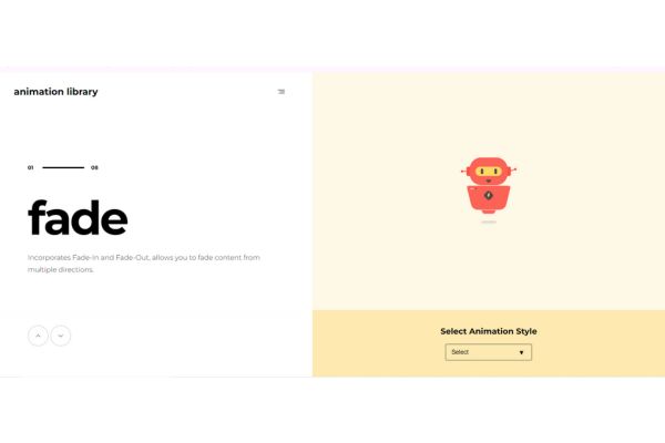
Animation Library offers a comprehensive set of pure CSS animations for advanced users who want control over their website’s motion aesthetics. It organizes animations into categories, each in its source file, simplifying the selection of specific effects.
A key feature is customization flexibility. Users can override default class names to create transitions that match their design vision.
Usage:
- Download the ZIP file containing the animation categories.
- Extract the files.
- Link to any desired animation file in your project.
Here’s a basic example:
<head>

  <link rel="stylesheet" href="path/to/fade.css">

</head>

<body>

  <div class="fadeInRight">This div will fade in from the right.</div>

</body>
Animation Library is ideal for projects needing custom animation timing, speed variations, and specific triggers. It’s best suited for developers who are comfortable with CSS manipulation and advanced coding techniques.
5. Hamburgers
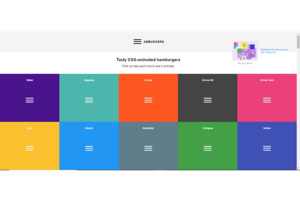
Hamburgers is a collection of over 10 CSS animations for hamburger menus, enhancing mobile navigation experiences. It’s well-suited for developers looking to add functionality to their mobile menus.
Usage:
Integrate Hamburgers via npm or include its CSS file via a CDN:
<head>

  <link rel="stylesheet" href="https://cdnjs.cloudflare.com/ajax/libs/hamburgers/1.1.3/hamburgers.min.css">

</head>
Create your hamburger icon in HTML:
<body>

  <button class="hamburger hamburger--slider" type="button">

    <span class="hamburger-box">

      <span class="hamburger-inner"></span>

    </span>

  </button>

</body>
Activate the transition with JavaScript:
<script>

  document.querySelector(".hamburger").addEventListener("click", function() {

    this.classList.toggle("is-active");

  });

</script>
Hamburgers offers various animation styles such as spin, collapse, and arrow transforms. The library is lightweight and efficient, making it suitable for mobile-first designs where performance is crucial.
6. Whirl
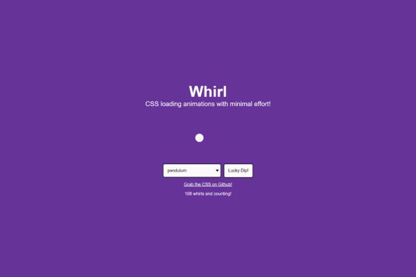
Whirl offers 106 unique CSS loading animations, designed to improve user experience during load times. It’s created for developers who want to add visually appealing loaders without creating them from scratch.
Usage:
Include Whirl via CDN, npm, or by downloading the CSS file:
<head>

  <link rel="stylesheet" href="https://cdnjs.cloudflare.com/ajax/libs/whirl/1.0.0/whirl.min.css">

</head>
Apply a predefined whirl to your HTML elements:
<body>

  <div class="whirl traditional">Loading...</div>

</body>
Whirl’s animations can be customized, allowing adjustments to aspects like speed, direction, and color. The animations are purely CSS-based, avoiding the need for JavaScript.
Whirl is particularly useful for projects needing frequent state changes or load indicators, such as single-page applications or dynamic web platforms.
7. Wicked CSS
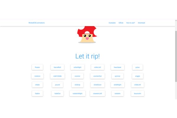
Wicked CSS offers numerous CSS-based animation effects to add dynamic elements to web pages. It’s designed for efficient performance without complex scripts.
Usage:
Include the Wicked CSS file in your project:
<head>

  <link rel="stylesheet" href="https://cdnjs.cloudflare.com/ajax/libs/wickedcss/1.1.1/wickedcss.min.css">

</head>
Apply animation classes to your HTML elements:
<body>

  <div class="wicked shake">Watch this element shake with Wicked CSS!</div>

</body>
Wicked CSS offers many effects including:
- Flips
- Fades
- Swings
The animations can be easily modified to suit your project’s needs. It’s suitable for various applications, from highlighting key areas on a landing page to adding playful elements to a personal blog.
8. Three Dots
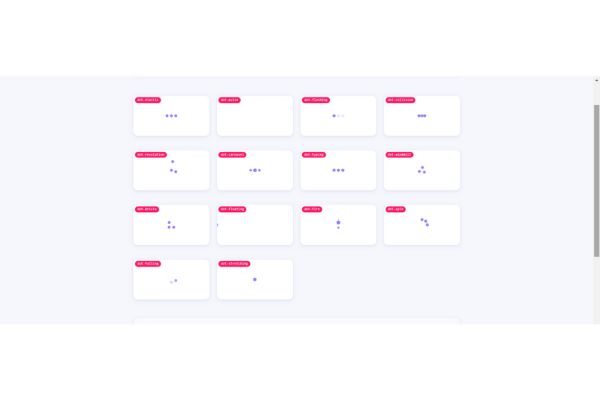
Three Dots focuses on subtle loading animations created with a single element. These loaders are lightweight, keeping web pages fast and responsive.
Usage:
Link to the library via a CDN or download the CSS file:
<head>

  <link rel="stylesheet" href="https://cdnjs.cloudflare.com/ajax/libs/three-dots/0.2.0/three-dots.min.css">

</head>
Apply the desired loader class to an element:
<body>

  <div class="dot-bricks"></div>

</body>
Three Dots offers various styles such as dot-pulse, dot-corner, and dot-spin. The library uses a single-element design approach, ensuring its animations are visually appealing and optimized for performance.
Customization is straightforward. You can adjust properties like size, color, and timing in your CSS:
.dot-pulse {

  background-color: #3498db; /* Example color change */

}
Three Dots is ideal for loading indicators in asynchronous content such as AJAX requests, image galleries, and dynamic data dashboards.
9. CSShake
CSShake introduces dynamic shaking animations to web design. It’s useful for drawing user attention to specific DOM elements, offering effects to highlight content, creating feedback mechanisms, or adding playful touches to web pages.
Usage: Include the CSShake CSS file via CDN or download:
<head>

  <link rel="stylesheet" href="https://cdnjs.cloudflare.com/ajax/libs/csshake/1.5.3/csshake.min.css">

</head>
Add a shake class to an element:
<body>

  <div class="shake-little">This div will have a little shake.</div>

</body>
CSShake provides various shake intensities and directions like shake-hard, shake-horizontal, and shake-vertical.
To customize shake intensity:
@keyframes custom-shake {

  0% { transform: translate(0); }

  25% { transform: translate(-5px, 0); }

  50% { transform: translate(5px, 0); }

  75% { transform: translate(-5px, 0); }

  100% { transform: translate(0); }

}
.custom-shake {
animation: custom-shake 0.5s infinite both;
}CSShake is particularly useful for contexts requiring quick user attention, such as form validation errors or urgent notifications.
10. VOV CSS
VOV CSS offers a range of pre-defined animations including fades, zooms, wheels, and slides. It’s suitable for various projects, from corporate websites to interactive applications.
Usage: Include VOV CSS via CDN and apply animation classes to HTML elements:
<head>

  <link rel="stylesheet" href="https://cdnjs.cloudflare.com/ajax/libs/vov.css/1.0.1/vov.min.css">

</head>
Apply an animation class:
<body>

  <div class="fadeIn">This div will fade in smoothly.</div>

  <div class="zoomIn">This div will zoom in.</div>

</body>
Customize animation duration:
.fadeIn {

  animation-duration: 2s;

}
VOV CSS is particularly suitable for:
- Highlighting call-to-action buttons
- Animating background images
- Adding elements to onboarding sequences
It’s beneficial for landing pages, interactive tutorials, and dynamic content benefiting from user interaction.
11. Mimic CSS
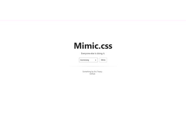
Mimic CSS is an inline CSS animation framework that creates smooth transitions. It operates within HTML, streamlining the animation process and reducing the need for additional files.
Usage: Write animation rules directly within HTML elements:
<div style="animation: fadeIn 2s ease-in;">

  This text will fade in smoothly.

</div>
Create custom keyframes:
<style>

@keyframes customBounce {

  0%, 20%, 50%, 80%, 100% { transform: translateY(0); }

  40% { transform: translateY(-30px); }

  60% { transform: translateY(-15px); }

}

</style>
<div style="animation: customBounce 1s infinite;">
Watch this element bounce!
</div>Mimic CSS is ideal for:
- Prototyping
- Microinteractions
- Simple animations that enhance user experience without extensive configuration
12. Animatopy
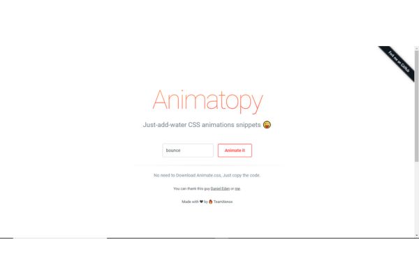
Animatopy provides ready-to-use CSS animation snippets for adding dynamic animations to websites. It includes animations like bounce, flash, shake, and more.
Usage: Include the Animatopy CSS:
<head>

  <link rel="stylesheet" href="https://cdn.jsdelivr.net/npm/animatopy@latest/animatopy.min.css">

</head>
Apply animation classes:
<body>

  <div class="animatopy-bounce">This div will bounce.</div>

  <div class="animatopy-flash">This div will flash.</div>

  <div class="animatopy-shake">This div will shake.</div>

</body>
Customize animations:
.animatopy-bounce {

  animation-duration: 2s;

}
Animatopy is useful for developers of all skill levels, allowing quick implementation of engaging animations in various web projects.
Selecting an appropriate CSS animation library can significantly improve your web development projects by incorporating engaging visual elements. Whether you prioritize simplicity, customization, or performance optimization, there’s a library that meets your needs. By leveraging these tools, developers can create more dynamic and interactive user experiences, potentially increasing user engagement and satisfaction1.

Arsalan Malik is a passionate Software Engineer and the Founder of Makemychance.com. A proud CDAC-qualified developer, Arsalan specializes in full-stack web development, with expertise in technologies like Node.js, PHP, WordPress, React, and modern CSS frameworks.
He actively shares his knowledge and insights with the developer community on platforms like Dev.to and engages with professionals worldwide through LinkedIn.
Arsalan believes in building real-world projects that not only solve problems but also educate and empower users. His mission is to make technology simple, accessible, and impactful for everyone.
Join us on dev community

