
|
Getting your Trinity Audio player ready...
|
When it comes to designing web interfaces, the intricacies of CSS can be both a blessing and a bane. Enter Tailwind CSS, a groundbreaking utility-first framework that simplifies the process, providing developers and designers alike with the agility to craft bespoke designs at record speeds. This essay delves into the core principles of Tailwind CSS, offering a comprehensive understanding of its unique approach, which stands in contrast to conventional CSS methodologies. By harnessing the efficiency of Tailwind, we will uncover how to effectively leverage its pre-styled form components and wield the power of utility classes to create forms that are not only aesthetically pleasing but also exquisitely responsive. Through detailed exploration, we embark on transforming the complex art of web design into an accessible craft, favoring precision and speed without sacrificing elegance.
Understanding Tailwind CSS
Tailwind CSS: Streamline Your Web Design with Utility-First Styling
Tailwind CSS has emerged as a revolutionary tool for web designers seeking efficiency and control. This utility-first CSS framework has upended traditional approaches to styling web pages, emphasizing rapid, in-line customization over copying and pasting from style sheets.
Fueled by a robust set of predefined classes, Tailwind enables developers to construct custom designs directly within HTML markup. Unlike conventional CSS methodologies that rely on crafting specific styles and then applying them, Tailwind’s atomic classes allow for building designs in a component-based manner, providing a high degree of reusability and scalability.
At the heart of Tailwind’s innovation is its mobile-first philosophy. This means styles are designed to be responsive from the get-go, ensuring seamless adaptation to various screen sizes. With utility classes like ‘md:text-lg’ or ‘lg:py-4’, designers can dictate how elements behave on different devices without leaving the HTML file.
Tailwind’s configuration file, tailwind.config.js, is a powerful feature that provides the ability to customize the framework to fit any project’s needs. Designers can define their themes, set default padding, margins, colors, and more, effectively creating a tailored design language unique to their project.
Crucially, Tailwind CSS advocates for a ‘purge’ feature. This process scans HTML files upon build, removing unused CSS – a practice that significantly reduces load times and boosts performance. By delivering only the necessary styles, Tailwind ensures that the end-user experience is as fast and fluid as it is visually appealing.
What Is Tailwind CSS? How To Install Via npm?
Tailwind CSS’s utility-first approach marks a transformative shift in web design, offering speed, efficiency, and versatility. By leveraging this innovative framework, developers and designers can actualize intricate designs with relative ease, ensuring a polished, professional outcome that aligns with the latest web standards.

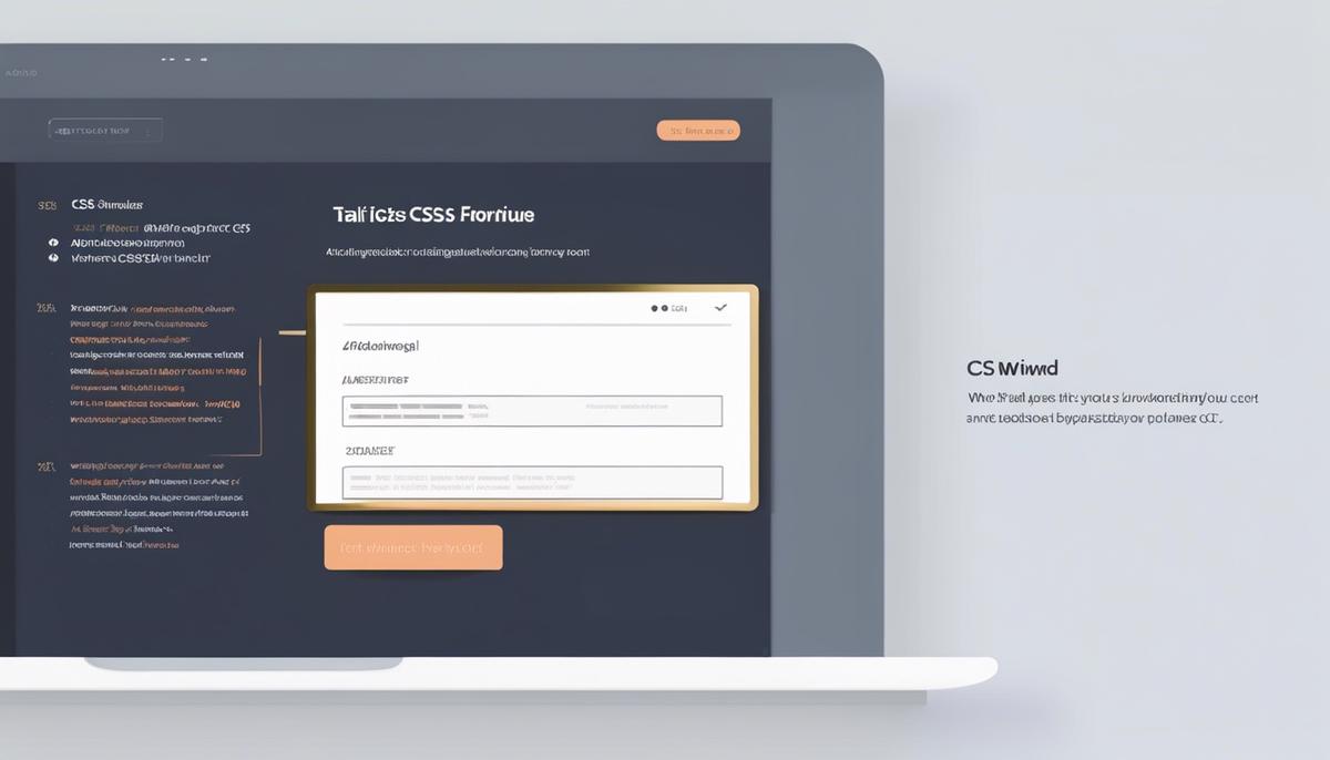
Tailwind Form Components
Building Forms with Tailwind CSS: A Step-by-Step Guide
Forms are a pivotal component of web applications, and with Tailwind CSS, designers can handcraft custom forms with ease and precision. To get started, ensure you have Tailwind CSS installed in your project. From there, creating stylish and responsive forms becomes an exercise in utility-first elegance.
Step 1: Form Structure and Container
Create a <div> element to serve as your form container. This will help you manage the form’s layout on your page.
<code><div class="container mx-auto p-4"><br>
  <form><br>
    <!-- form elements will go here --><br>
  </form><br>
</div></code>
Step 2: Input Fields
To add input fields, use the Tailwind CSS classes to style them. Tailwind provides control over size, border, padding, and more. For instance:
<code><input class="bg-white focus:outline-none border border-gray-300 rounded-lg py-2 px-4 block w-full appearance-none leading-normal" type="email" placeholder="[email protected]"></code>In this snippet, notice the comprehensive control over visual attributes. The focus:outline-none class removes the default focus highlight, allowing for complete stylistic control.
Step 3: Labels and Accessibility
Ensure each input field has an associated label, which is crucial for accessibility. Use the sr-only class to visually hide the label if it’s not needed for design purposes but maintain screen reader accessibility.
<code><label class="sr-only" for="email">Email:</label><br>
<input id="email" class="..." type="email" placeholder="[email protected]"></code>
Step 4: Form Layout with Flexbox
Tailwind’s Flexbox utilities come in handy for arranging form elements. Use flex, items-center, or justify-between to align inputs and labels.
<code><div class="flex items-center border-b border-teal-500 py-2"><br>
  <input class="..." type="text" placeholder="Enter your name"><br>
</div></code>
Step 5: Responsive Design
Tailwind’s responsive design utilities ensure your form looks great on all devices. Use the sm:, md:, lg:, and xl: prefixes to apply styles based on the screen size.
<code><input class="w-full px-3 py-2 leading-tight text-gray-700 border rounded shadow appearance-none md:w-1/2" type="text"></code>Step 6: Buttons and Interactivity
Buttons play a critical role in form interaction. Style them with Tailwind to stand out and cue users to action.
<code><button class="bg-blue-500 hover:bg-blue-700 text-white font-bold py-2 px-4 rounded"><br>
  Submit<br>
</button></code>
Use the hover: prefix to alter the button’s appearance on mouseover, improving user experience.
Step 7: Validation and Error Handling
Finally, incorporate validation feedback for user inputs. Tailwind CSS provides text and border colors for highlighting errors.
<code><input class="w-full bg-red-100 border border-red-400 text-red-700 px-4 py-3 rounded relative" id="email" type="email"><br>
<span class="text-sm text-red-600">Please enter a valid email address.</span></code>
By following these practical steps, incorporating the responsive and customizability features of Tailwind CSS, anyone can construct aesthetically pleasing and functionally robust forms—elevating both the user experience and the design process. Tailwind’s utility-first approach simplifies the path from concept to execution, making it a formidable tool for crafting modern web interfaces.

Customizing Forms with Tailwind
Tailoring Tailwind: Advanced Customization Techniques for Forms
Form customization in Tailwind CSS is an endeavor that can set your web projects apart. While the initial setup leans towards utility-first principles, diving into deeper personalization requires a nuanced approach. It’s not just about the look; form functions are critical. Mastering customization translates to improved user experiences and UI integrity across devices.
Let’s get to the nuts and bolts of advanced Tailwind CSS techniques for forms.
Fine-Tuning with Tailwind Variants
The essence of aesthetic individuality lies in variation. Tailwind’s configuration file grants access to control over pseudo-classes. Want hover, focus, or disabled styles for form elements? Introducing ‘variants’ in tailwind.config.js makes it a breeze. Remember to streamline; only extend what’s necessary to keep the build size in check.
Harnessing the Power of Plugins
Plugins elevate forms from basic to bespoke. Tailwind’s plugin system allows the injection of custom utilities and components. Leverage this to introduce custom styles for form elements that Tailwind might not cover out-of-the-box. Plugins like ‘tailwindcss-custom-forms’ can be a starting point. Injecting personal flair becomes second nature once you harness the power of plugins.
Dynamic Theming with CSS Variables
Static is stale. Embrace dynamic theming for Tailwind forms using CSS variables. Define variables within the tailwind.config.js for theme colors, border widths, and more. Apply these variables within your utility classes for real-time theme adjustments. Tailwind’s config merges seamlessly with modern CSS, offering a bridge between custom properties and utility-first design.
Advanced Form Input Styling
Basic styling isn’t enough. Turn attention to detailing like input focus, placeholder customization, and selection control. Tailwind’s focus-within and placeholder classes offer direct access to style these critical states. The selection of checkboxes and radio buttons can equally be enhanced by utilizing custom designs with SVGs and Tailwind’s background utility classes, ensuring a slick, user-friendly form.
Leveraging JavaScript for Dynamic Form Behavior
Tailwind forms are not islands. They often require JavaScript for enhanced functionality. Combine Tailwind’s design capabilities with JavaScript’s dynamism for real-time form validation, field formatting, and conditional field displays. This synergy between style and script empowers the creation of intelligent, interactive forms that react responsively to user inputs.
Wrap-Up
Cut through complexity with the precision of Tailwind CSS in your forms. Innovate within the framework and beyond, merging configuration tweaks with plugin power, and threading dynamic styling throughout your forms. Tailwind’s marriage with JavaScript propels form functionality into new dimensions.
Delve into these advanced techniques and build Tailwind forms that not only look bespoke but behave intelligently, offering standout user experiences that mesh seamlessly with the rest of your design ethos. Customized Tailwind CSS forms are not just possible—they’re your playground for innovation and excellence in design.
Mastering Tailwind CSS for form creation is akin to adding a superpower to your web development arsenal. This utility-first framework liberates the developer from the constraints of traditional CSS, providing an extensive palette of utilities that foster innovation and rapid iteration. With this newfound knowledge, you are now equipped to tailor each form to the unique contours of your design vision, ensuring that your web creations are both functional and captivating. Tailwind’s reimagining of CSS encourages us to embrace a future where the complexity of web design is elegantly abstracted, allowing form and function to converge beautifully. Let this be the launchpad from which your expertise in Tailwind CSS forms takes flight, guiding you towards creating user experiences that are as delightful to interact with as they are to behold..

Arsalan Malik is a passionate Software Engineer and the Founder of Makemychance.com. A proud CDAC-qualified developer, Arsalan specializes in full-stack web development, with expertise in technologies like Node.js, PHP, WordPress, React, and modern CSS frameworks.
He actively shares his knowledge and insights with the developer community on platforms like Dev.to and engages with professionals worldwide through LinkedIn.
Arsalan believes in building real-world projects that not only solve problems but also educate and empower users. His mission is to make technology simple, accessible, and impactful for everyone.
Join us on dev community