|
Getting your Trinity Audio player ready...
|
In the fast-paced world of branding, your logo is often the first impression your business makes. It’s the face of your brand, representing its values, mission, and style in a single visual symbol. As we enter 2024, the logo design landscape continues evolving, reflecting new technologies, consumer preferences, and cultural influences. Staying updated with these trends is crucial for businesses looking to maintain a fresh and relevant image. Let’s dive into the top 10 logo design trends that are set to dominate in 2024.
Minimalist Logos
Simplicity in Design
Minimalism is more than just a trend; it’s a design philosophy that’s been gaining momentum for years. In 2024, minimalist logos continue to be a popular choice for brands that want to convey clarity, sophistication, and a focus on the essentials.
Why Minimalism Continues to Thrive
Minimalist logos strip away the unnecessary, leaving only the most essential elements. This makes them versatile, easily recognizable, and timeless. In an age where consumers are bombarded with information, a simple, clean logo can stand out and make a strong impact.
Examples of Minimalist Logos in 2024
Think of brands like Apple or Nike—logos that are iconic and straightforward. In 2024, more companies are following suit, embracing minimalism to create logos that are not only visually appealing but also functional across different media.
Responsive Logos
Adaptability Across Different Platforms
With the increasing variety of devices and screen sizes, responsive logos are becoming a must-have. These logos are designed to adapt to different display environments, ensuring that they look great whether they’re on a smartphone, tablet, or billboard.
How Responsive Logos Enhance User Experience
A responsive logo maintains its integrity and readability regardless of size or context. This adaptability is key in 2024, as brands need to ensure their logos are consistently effective in digital and print formats.
Key Features of Responsive Logos in 2024
In 2024, expect to see logos that are designed with modular elements, allowing them to scale down to a simpler form for small screens or expand with more detail for larger displays. Brands like Coca-Cola have successfully implemented this approach.
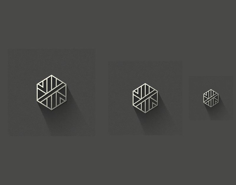
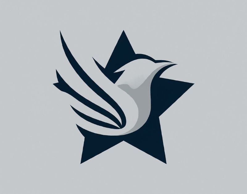
Geometric Logos
The Appeal of Geometric Shapes
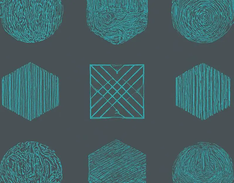
Geometric logos use shapes like circles, squares, and triangles to create a sense of balance, harmony, and precision. These logos are visually striking and convey a modern, professional image.
Modern Examples of Geometric Logos
In 2024, we’re seeing a resurgence in the use of bold geometric shapes in logo design. Companies in tech, finance, and engineering are particularly drawn to these designs, as they suggest structure and stability.
How to Incorporate Geometry into Your Logo Design
When designing a geometric logo, consider how the shapes align with your brand’s identity. For example, a tech company might use angular shapes to convey cutting-edge innovation, while a wellness brand could opt for softer, rounded forms to evoke calm and balance.
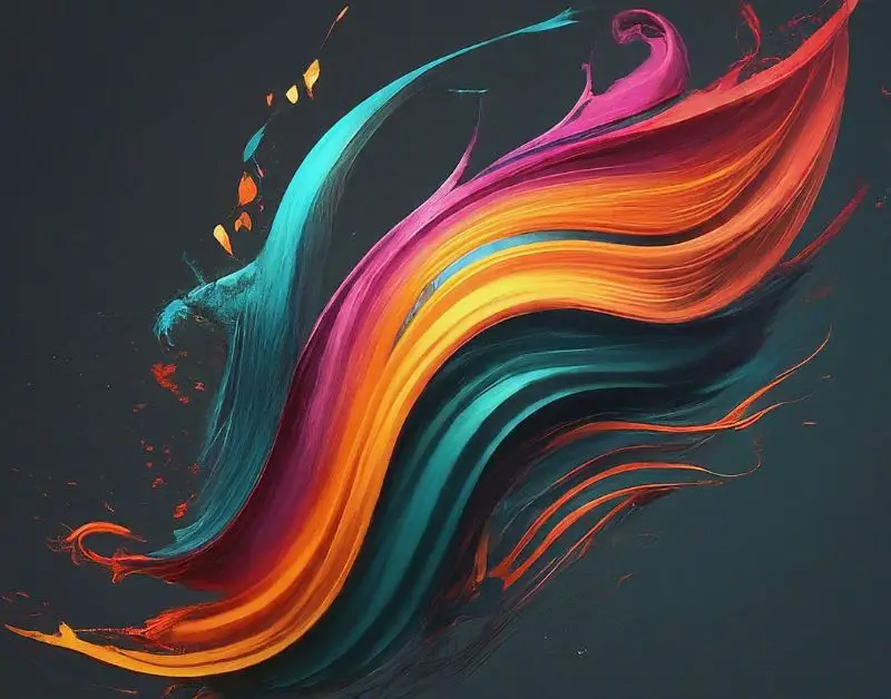
Gradient Logos
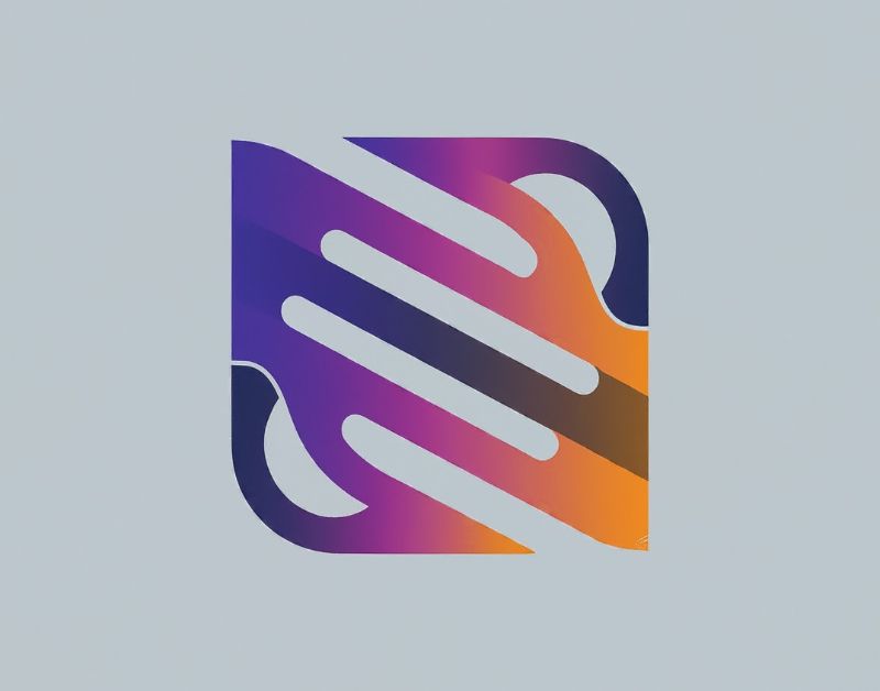
The Resurgence of Gradients in Design
Gradients have made a strong comeback in recent years, and they’re set to be even more prominent in 2024. These color transitions add depth, movement, and energy to a logo, making it more dynamic and engaging.
How Gradients Add Depth and Dimension
By blending colors smoothly, gradients can give a logo a three-dimensional feel without relying on actual 3D elements. This technique is perfect for brands looking to create a logo that feels modern and vibrant.
Popular Gradient Color Schemes in 2024
Expect to see gradients in bold, unconventional color combinations in 2024, such as neon pinks with deep blues or earthy tones transitioning into metallics. These choices help brands stand out and convey a sense of creativity and forward-thinking.
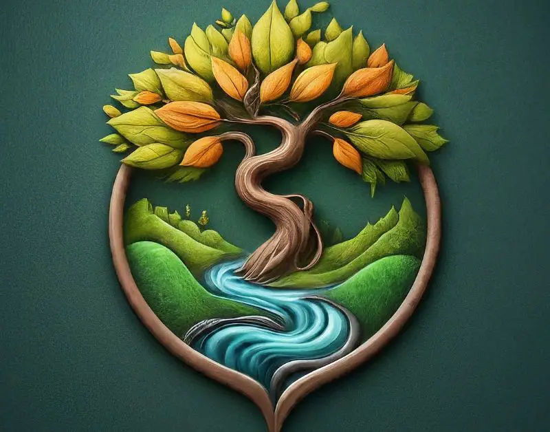
Abstract Logos
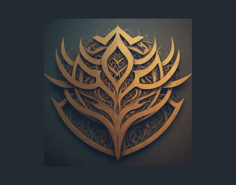
The Creative Freedom of Abstract Design
Abstract logos use shapes, lines, and colors in a way that doesn’t directly represent objects or people but still conveys a brand’s essence. This type of logo allows for a high degree of creativity and can be highly effective when done right.
Unique and Memorable Abstract Logos
In 2024, abstract logos are being embraced by brands that want to communicate complexity, uniqueness, or a modern edge. These designs can be both intriguing and memorable, leaving a lasting impression on consumers.
Tips for Designing an Abstract Logo
When creating an abstract logo, focus on how the shapes and colors make your audience feel rather than what they represent. This emotional connection can be powerful, making your brand stand out in a crowded marketplace.
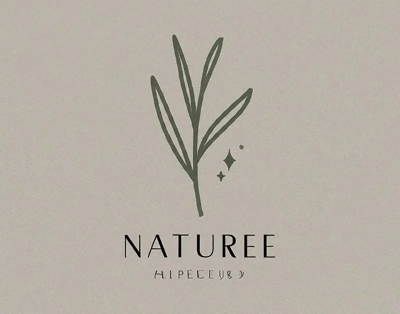
Hand-Drawn Logos
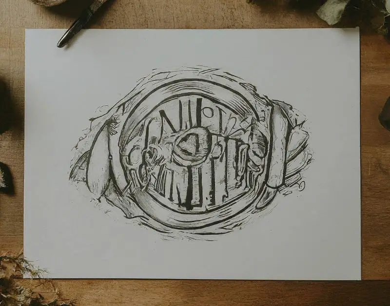
The Charm of Authenticity and Personality
Hand-drawn logos bring a personal touch to branding, making them feel more human and approachable. In 2024, this trend is all about showcasing authenticity and craftsmanship.
Why Hand-Drawn Designs Resonate with Audiences
As consumers seek more genuine and relatable brands, hand-drawn logos offer a refreshing break from the digital slickness that dominates much of today’s design. These logos tell a story and often feel more organic and heartfelt.
Successful Brands Using Hand-Drawn Logos
Many artisanal brands, cafés, and creative industries are opting for hand-drawn logos in 2024. These designs can be intricate or simple but always carry a sense of originality that resonates with customers.
Vintage and Retro Logos
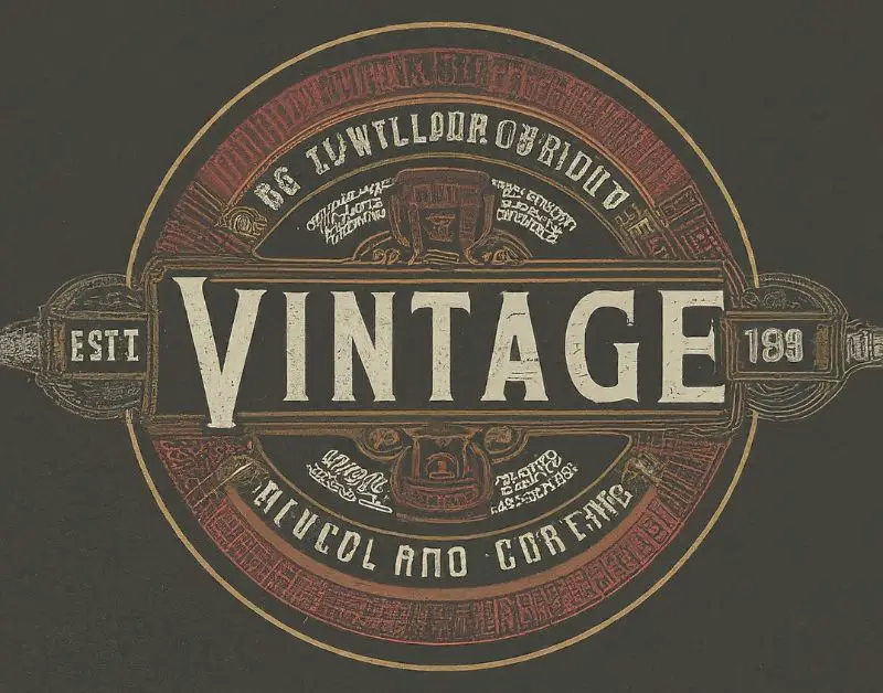
Nostalgia in Branding
Vintage and retro logos tap into the power of nostalgia, evoking memories of simpler times. This trend is thriving in 2024, as brands look to connect with audiences on an emotional level.
The Influence of Past Eras on Modern Design
From the Roaring Twenties to the bold designs of the 1980s, different decades are inspiring today’s logo designs. These logos often feature classic typography, muted color palettes, and iconic symbols that harken back to a bygone era
Examples of Effective Vintage Logos in 2024
Brands across various industries, from fashion to food and beverage, are successfully incorporating vintage elements into their logos. This trend not only attracts older generations but also appeals to younger consumers who appreciate the charm and character of retro aesthetics.
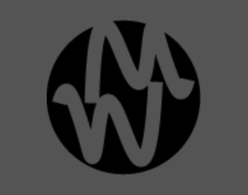
Negative Space Logos
The Clever Use of Negative Space
Negative space logos use the empty spaces around and between the main elements of the logo to create additional imagery or meaning. This technique is a favorite among designers for its cleverness and subtlety.
Creating Visual Interest and Meaning
By using negative space creatively, designers can add layers of meaning to a logo, making it more intriguing and thought-provoking. This trend continues to grow in 2024 as brands seek to stand out with intelligent design.
Famous Brands Utilizing Negative Space in 2024
Brands like FedEx and WWF have long used negative space to great effect, and this trend is being adopted by more companies in 2024. It’s a great way to create a logo that’s both simple and sophisticated.
Animated Logos
Bringing Logos to Life with Animation
As digital media becomes more prevalent, animated logos are becoming a key trend in 2024. These logos aren’t just static images; they come to life with movement, adding an extra dimension to brand identity.
How Animation Captures Attention
Animated logos are particularly effective in online spaces, where capturing a viewer’s attention quickly is crucial. A logo that moves or changes can convey a brand’s energy and dynamism, making it more memorable.
Examples of Animated Logos on Trend in 2024
In 2024, look for animated logos that incorporate subtle, elegant animations—such as a logo that gently pulses, morphs, or changes colors—to enhance the brand experience without overwhelming the viewer.
3D Logos
The Rise of Three-Dimensional Design
Three-dimensional (3D) logos are gaining traction as brands look for ways to stand out in a crowded market. These logos add depth and realism, making them visually striking and memorable.
How 3D Logos Enhance Brand Perception
A well-crafted 3D logo can make a brand appear more innovative and forward-thinking. These logos often use shadows, gradients, and layering to create the illusion of depth, making them pop off the screen or page.
Techniques for Creating a Stunning 3D Logo
Designing a 3D logo requires careful consideration of lighting, perspective, and texture. In 2024, we’re seeing a trend towards more subtle, refined 3D logos that use these elements to enhance rather than dominate the design.
Monogram Logos
The Elegance of Initials in Branding
Monogram logos use the initials of a brand name to create a stylish, often sophisticated design. This trend is popular in 2024 for its ability to convey luxury and professionalism in a compact form.
How to Craft a Unique Monogram Logo
When designing a monogram logo, focus on typography and symmetry. The key is to make the letters flow together seamlessly while still being legible. This creates a logo that’s both aesthetically pleasing and meaningful.
Popular Monogram Logos in 2024
Fashion brands, luxury goods, and personal brands are especially drawn to monogram logos in 2024. These logos are timeless yet trendy, making them a smart choice for brands looking to project elegance and class.
Conclusion
The logo trends of 2024 reflect a blend of innovation and nostalgia, with brands embracing both cutting-edge techniques like animation and 3D design, as well as classic elements like minimalism and vintage aesthetics. Choosing the right logo design trend for your brand involves understanding your audience, your brand’s values, and the message you want to convey. As the digital landscape continues to evolve, staying updated with these trends will help ensure that your logo remains fresh, relevant, and impactful.
FAQs
1. What is the most popular logo design trend in 2024?
Minimalist logos continue to be a top trend due to their timeless appeal and versatility across platforms.
2. How do I choose the right logo style for my brand?
Consider your brand’s identity, target audience, and the message you want to convey. Align these with the trends that best reflect your values.
3. Can a logo design combine multiple trends?
Absolutely! Many brands successfully merge trends, like combining minimalism with responsive design or gradients with geometric shapes.
4. What software is best for creating trendy logos in 2024?
Popular software includes Adobe Illustrator, Figma, and Canva, which offer tools for both beginners and experienced designers.
5. How often should a brand update its logo to stay trendy?
Brands should consider updating their logo every 5-10 years to stay current, though minor tweaks can be made more frequently as needed.

Arsalan Malik is a passionate Software Engineer and the Founder of Makemychance.com. A proud CDAC-qualified developer, Arsalan specializes in full-stack web development, with expertise in technologies like Node.js, PHP, WordPress, React, and modern CSS frameworks.
He actively shares his knowledge and insights with the developer community on platforms like Dev.to and engages with professionals worldwide through LinkedIn.
Arsalan believes in building real-world projects that not only solve problems but also educate and empower users. His mission is to make technology simple, accessible, and impactful for everyone.
Join us on dev community