|
Getting your Trinity Audio player ready... |
Typography plays a crucial role in graphic design, shaping how messages are conveyed and influencing how people perceive a brand. For a logo that truly stands out, understanding typography and its various styles is key to selecting the perfect typeface for your design.
In this article, we’ll explore what typography is, why it matters in logo design, and delve into the different types of typography. We’ll also guide you through the process of incorporating typography effectively into your projects.
Why is typography important in logo design?
Logo design is a vital aspect of business branding, yet many designers still overlook the significance of strong typography in creating an impactful logo.
Why is it so important?
Poor typography can harm your brand’s reputation and even hurt sales. It can also frustrate customers who struggle to read unclear text.
Since people tend to trust visual cues more than written ones, good typography helps create a strong visual impact that’s easily understood. Well-designed logos, in particular, are more memorable and easier to recognize.
Typography, the art of arranging type, plays a key role in shaping a brand’s visual identity, whether for a logo, website, or any other design element.
Here are a few examples of typography logos that are well-designed and effective:
- Google: The Google logo is a great example of how simple, clean typography can be used to create a strong and iconic brand identity. The logo uses a custom sans-serif typeface called “Product Sans”, which is simple and modern, and it effectively conveys the brand’s innovation and forward-thinking nature.
- Nike: The Nike logo is another example of how effective typography can be in creating a strong brand identity. The logo uses a simple sans-serif typeface called “Futura”, which is clean and modern, and it effectively conveys the brand’s athletic and energetic personality.
- IBM: The IBM logo is a good example of how typography can be used to create a sophisticated and professional brand image. The logo uses a custom serif typeface called “Neue Haas Grotesk”, which is clean and timeless, and it effectively conveys the brand’s expertise and reliability.
- Coca-Cola: The Coca-Cola logo is a classic example of how typography can be used to create a strong and iconic brand identity. The logo uses a custom script typeface called “Spencerian Script”, which is elegant and timeless, and it effectively conveys the brand’s fun and playful personality.
What are the different types of typography?
There are many different types of typography that can be used in logo design. We’ll cover these below, but first, let’s discuss the basics:
1. Serif
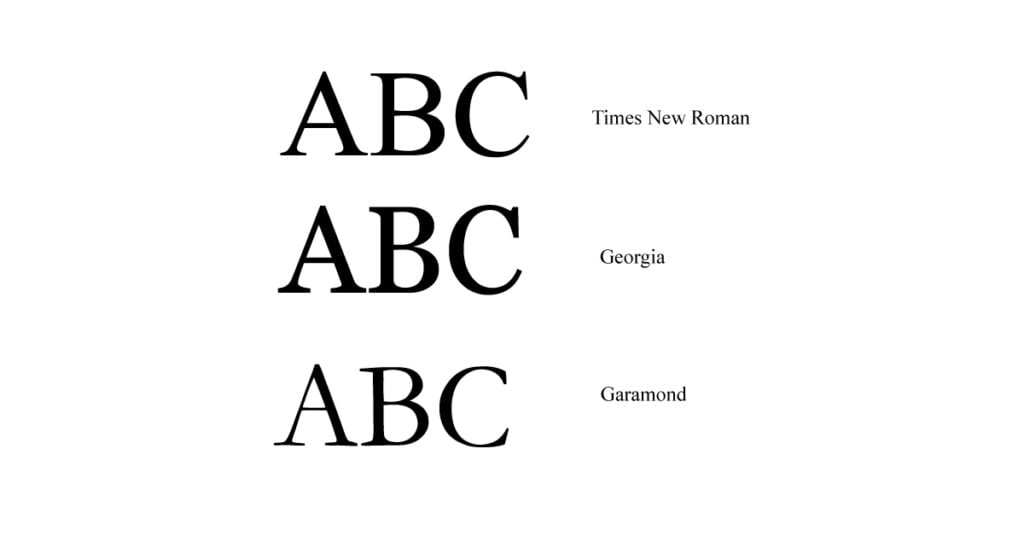
Serifs are small lines or strokes added to the ends of letters, helping to make text more readable. They are commonly used in both print and digital media, including logos and magazines. One of the most well-known serif fonts is Times New Roman, created in 1932 by Stanley Morison and Victor Lardent.
2. Sans Serif
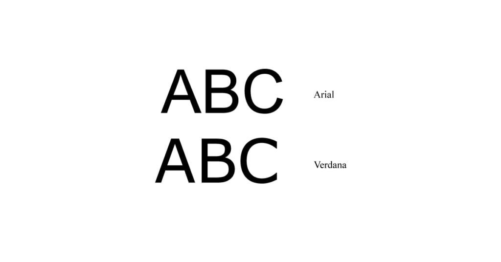
Sans serif fonts are easier to read on screens compared to serif fonts. They are commonly used for body text, as well as titles, headings, and headlines.
One of the most popular sans serif typefaces is Helvetica Neue, which has been around since 1957!
3. Cursive
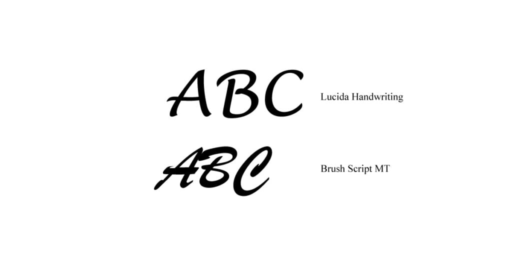
Cursive is a type of script font that combines straight lines and curves to create an elegant, friendly appearance. The letters are typically small and closely spaced, with little or no vertical separation between them.
Cursive fonts can evoke warmth and approachability, making them ideal for logos of companies like bakeries that want to appear friendly and welcoming. They can also convey professionalism when used by organizations handling sensitive information, such as financial or health-related services, helping to create a trustworthy and refined brand image.
4. Script
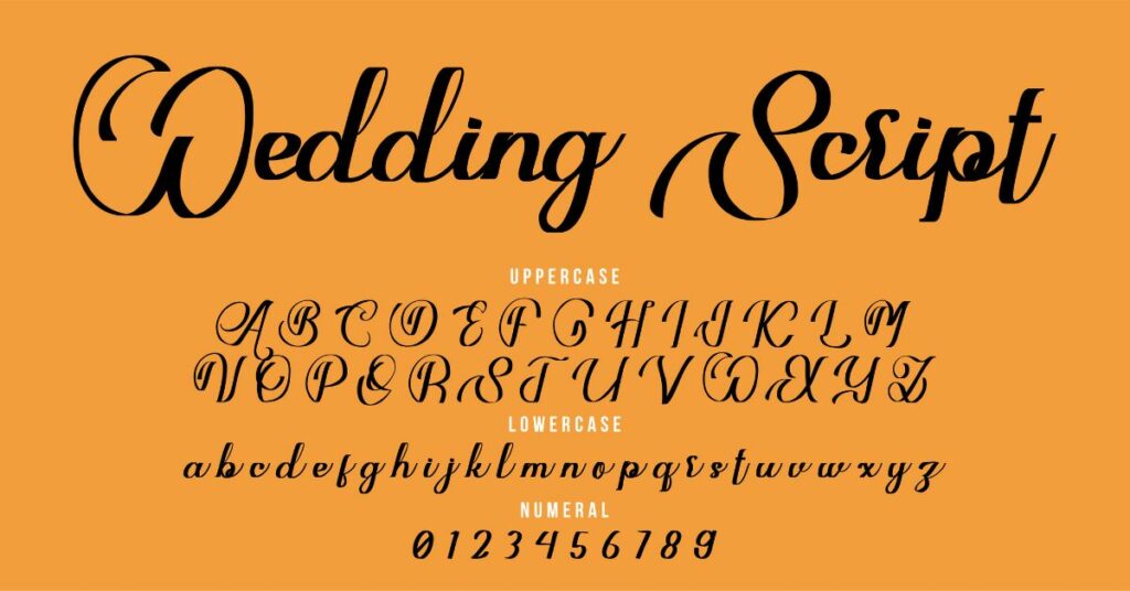
Script fonts are a style of typeface that mimics handwriting, giving them a personal and unique touch. They often showcase the designer’s creativity and effort in their intricate details.
These fonts are commonly used in logo design because they stand out more than traditional serif or sans-serif fonts. With their flowing curves and loops, script fonts offer an artistic, distinctive look that enhances the appeal of branding projects.
5. Decorative
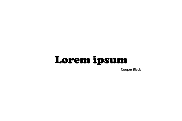
- Decorative typography is used to add style to a logo.
- This typography is used to add personality to a logo.
- Decorative typography is used to add a unique look to a logo.
- This typography adds an element of creativity and individuality that can’t be found anywhere else in the world!
How to Make a Typographic Logo

A typographic logo is a logo that consists entirely of text, using various fonts and/or text treatments to create visual interest and differentiate a brand. Here is a step-by-step guide on how to create a typographic logo:
- Start by identifying the name of your brand and what message you want to convey through your logo. This will help you determine the tone and style of the text and font you use.
- Research different font options and choose one that aligns with the tone and style of your brand. Keep in mind that the font you choose should be legible and easy to read, especially if it will be used in small sizes.
- Experiment with different font treatments, such as size, color, spacing, and alignment, to create visual interest and distinguish your logo from others.
- Consider using multiple fonts in your logo to add depth and contrast. However, be careful not to use too many fonts as it can make your logo look cluttered and confusing.
- Create a few different design concepts using the font and text treatments you have chosen. It can be helpful to sketch these out on paper or create digital mockups using graphic design software.
- Refine and finalize your design by considering factors such as legibility, balance, and overall aesthetic appeal.
- Create a digital version of your logo using a vector graphics editor, such as Adobe Illustrator, to ensure that it can be easily resized and used in various formats without losing quality.
- Save your logo in a variety of file formats, including .jpg, .png, and .eps, to ensure that it can be used for a different purposes.
What is leading typography?
Leading, also known as line height, is the vertical distance between the baselines of successive lines of type. In simple terms, leading is the amount of space between lines of text. It can be measured by the height of the letter “x”, or the height of a line of text expressed in pixels or points.

Arsalan Malik is a passionate Software Engineer and the Founder of Makemychance.com. A proud CDAC-qualified developer, Arsalan specializes in full-stack web development, with expertise in technologies like Node.js, PHP, WordPress, React, and modern CSS frameworks.
He actively shares his knowledge and insights with the developer community on platforms like Dev.to and engages with professionals worldwide through LinkedIn.
Arsalan believes in building real-world projects that not only solve problems but also educate and empower users. His mission is to make technology simple, accessible, and impactful for everyone.
Join us on dev community

