|
Getting your Trinity Audio player ready... |
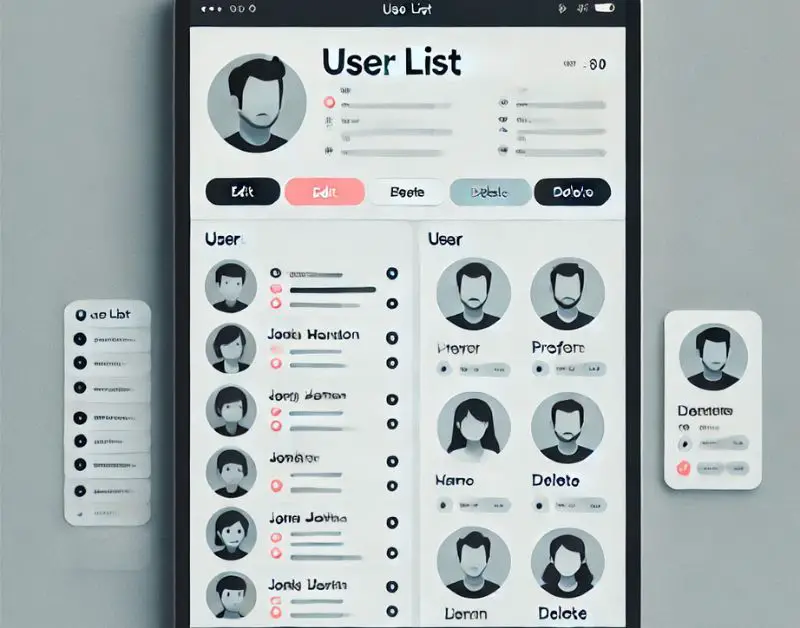
In today’s digital age, user interfaces (UI) are essential for offering a seamless experience to users. A clean and functional UI for displaying user lists is crucial for applications like admin dashboards, project management tools, or even social networking platforms. Bootstrap, a powerful front-end framework, provides an easy way to build responsive and attractive UI components. In this article, we’ll go through how to create a User List UI design using Bootstrap.

How TO Make User Lists Using HTML And CSS
Prerequisites
Before starting, ensure you have basic knowledge of:
- HTML
- CSS
- Bootstrap (v5.0+)
If you are new to Bootstrap, it’s a framework that allows you to quickly design websites and web apps with pre-built components and a responsive grid system.
Step 1: Setting Up the Environment
To use Bootstrap, you’ll need to include its CSS and JS files in your project. You can either download them or use a CDN.
Example of Including Bootstrap via CDN:
<!DOCTYPE html>
<html lang="en">
<head>
  <meta charset="UTF-8">
  <meta name="viewport" content="width=device-width, initial-scale=1.0">
  <title>User List UI Design</title>
  <!-- Bootstrap CSS -->
  <link href="https://cdn.jsdelivr.net/npm/[email protected]/dist/css/bootstrap.min.css" rel="stylesheet">
</head>
<body>
  <!-- Content goes here -->

  <!-- Bootstrap JS Bundle -->
  <script src="https://cdn.jsdelivr.net/npm/[email protected]/dist/js/bootstrap.bundle.min.js"></script>
</body>
</html>
Step 2: Basic Structure for the User List
We’ll create a simple user list that contains a table layout for displaying the user’s information such as their name, email, and role. We’ll also add some action buttons for each user (e.g., edit and delete).
HTML Structure for the User List:
<div class="container mt-5">
  <h2 class="mb-4 text-center">User List</h2>
  <table class="table table-bordered table-striped table-hover">
    <thead class="table-dark">
      <tr>
        <th>#</th>
        <th>Name</th>
        <th>Email</th>
        <th>Role</th>
        <th>Actions</th>
      </tr>
    </thead>
    <tbody>
      <tr>
        <td>1</td>
        <td>John Doe</td>
        <td>[email protected]</td>
        <td>Admin</td>
        <td>
          <button class="btn btn-sm btn-primary">Edit</button>
          <button class="btn btn-sm btn-danger">Delete</button>
        </td>
      </tr>
      <tr>
        <td>2</td>
        <td>Jane Smith</td>
        <td>[email protected]</td>
        <td>Editor</td>
        <td>
          <button class="btn btn-sm btn-primary">Edit</button>
          <button class="btn btn-sm btn-danger">Delete</button>
        </td>
      </tr>
    </tbody>
  </table>
</div>
Explanation:
- Container (
.container): A Bootstrap class that centers the content and adds padding. - Table (
.table): Bootstrap’s class for creating responsive tables. - Table head (
.thead-dark): Adds a dark background to the table header. - Buttons (
.btn): Bootstrap’s button class. We use different button variants (e.g.,btn-primary,btn-danger) for actions.
Step 3: Enhancing the Design with Bootstrap Utilities
Bootstrap provides utilities that can be used to add spacing, alignment, and other styling tweaks without writing custom CSS.
Add Some Padding and Centered Text:
<div class="container mt-5">
  <h2 class="mb-4 text-center">User List</h2>
  <table class="table table-bordered table-striped table-hover">
    <thead class="table-dark">
      <tr>
        <th>#</th>
        <th>Name</th>
        <th>Email</th>
        <th>Role</th>
        <th class="text-center">Actions</th>
      </tr>
    </thead>
    <tbody>
      <tr>
        <td>1</td>
        <td>John Doe</td>
        <td>[email protected]</td>
        <td>Admin</td>
        <td class="text-center">
          <button class="btn btn-sm btn-primary">Edit</button>
          <button class="btn btn-sm btn-danger">Delete</button>
        </td>
      </tr>
      <!-- More rows can be added here -->
    </tbody>
  </table>
</div>
Changes Made:
mt-5: Adds top margin to space out the elements.text-center: Centers the heading and the action buttons in their respective columns.
Step 4: Responsive Design
One of Bootstrap’s strengths is its built-in responsiveness. The above table will already be responsive on most screens. However, for small screens, you might want to ensure the table scrolls horizontally instead of breaking the layout.
To make the table scrollable on smaller screens:
<div class="container mt-5">
  <h2 class="mb-4 text-center">User List</h2>
  <div class="table-responsive">
    <table class="table table-bordered table-striped table-hover">
      <thead class="table-dark">
        <tr>
          <th>#</th>
          <th>Name</th>
          <th>Email</th>
          <th>Role</th>
          <th class="text-center">Actions</th>
        </tr>
      </thead>
      <tbody>
        <tr>
          <td>1</td>
          <td>John Doe</td>
          <td>[email protected]</td>
          <td>Admin</td>
          <td class="text-center">
            <button class="btn btn-sm btn-primary">Edit</button>
            <button class="btn btn-sm btn-danger">Delete</button>
          </td>
        </tr>
        <!-- More rows can be added here -->
      </tbody>
    </table>
  </div>
</div>
What Changed?
table-responsive: This Bootstrap class wraps the table and ensures that it becomes scrollable on smaller screens instead of overflowing the page.
Step 5: Customizing with CSS (Optional)

While Bootstrap provides a great design out of the box, you might want to customize the UI slightly for a unique look. For instance, you can add your own CSS to style the buttons or rows further.
Example Custom CSS:
<style>
  .table-hover tbody tr:hover {
    background-color: #f0f8ff; /* Custom hover color */
  }

  .btn-primary {
    background-color: #007bff;
    border-color: #007bff;
  }

  .btn-danger {
    background-color: #dc3545;
    border-color: #dc3545;
  }
</style>
Conclusion
Creating a user list UI with Bootstrap is straightforward and helps you quickly build responsive, functional designs. With its built-in classes, you can focus more on the structure and usability rather than reinventing the wheel with CSS from scratch. You can also further extend the list with user avatars, pagination, and search functionality depending on your needs.
What Is Tailwind CSS? How To Install Via npm?
How To Handle CSS Precedence When Using React And CSS Classes?
Quick CSS Units Cheat Sheet for Web Designers

Arsalan Malik is a passionate Software Engineer and the Founder of Makemychance.com. A proud CDAC-qualified developer, Arsalan specializes in full-stack web development, with expertise in technologies like Node.js, PHP, WordPress, React, and modern CSS frameworks.
He actively shares his knowledge and insights with the developer community on platforms like Dev.to and engages with professionals worldwide through LinkedIn.
Arsalan believes in building real-world projects that not only solve problems but also educate and empower users. His mission is to make technology simple, accessible, and impactful for everyone.
Join us on dev community


