|
Getting your Trinity Audio player ready...
|
In the fast-paced world of web development, having a responsive and flexible grid system is essential. Tailwind CSS Grid offers a powerful solution to create dynamic layouts with ease. In this comprehensive guide, we will explore Tailwind CSS Grid in-depth, focusing on various grid column variations and customization options. Along the way, we’ll provide you with code examples to illustrate each concept.
What Is Tailwind CSS? How To Install Via npm?
Understanding the Basics
Before we dive into the intricacies of Tailwind CSS Grid, let’s establish a solid foundation by understanding some fundamental concepts.
1. The Grid Structure
A grid system is a layout structure that divides a web page into rows and columns. Each grid item can be placed in specific rows and columns, allowing for precise control over the layout.
2. Grid Columns
Grid columns define the horizontal divisions within a grid. Tailwind CSS Grid provides a range of classes to specify the number of columns in a grid, making it incredibly versatile.
Now, let’s explore these grid column variations and their code examples:
Exploring Grid Column Variations

Tailwind CSS Grid offers a set of classes to control the number of columns in a grid. These classes are intuitive and easy to use. Here are some examples:
1. grid-cols-1 – Single Column Grid
<div class="grid grid-cols-1">
  <!-- Your content here -->
</div>
This class creates a grid with a single column that spans the full width of the container.
2. grid-cols-2 – Two Columns Grid
<div class="grid grid-cols-2">
  <!-- Your content here -->
</div>
This class creates a grid with two equally sized columns.
3. grid-cols-3 – Three Columns Grid
<div class="grid grid-cols-3">
  <!-- Your content here -->
</div>
This class creates a grid with three equally sized columns.
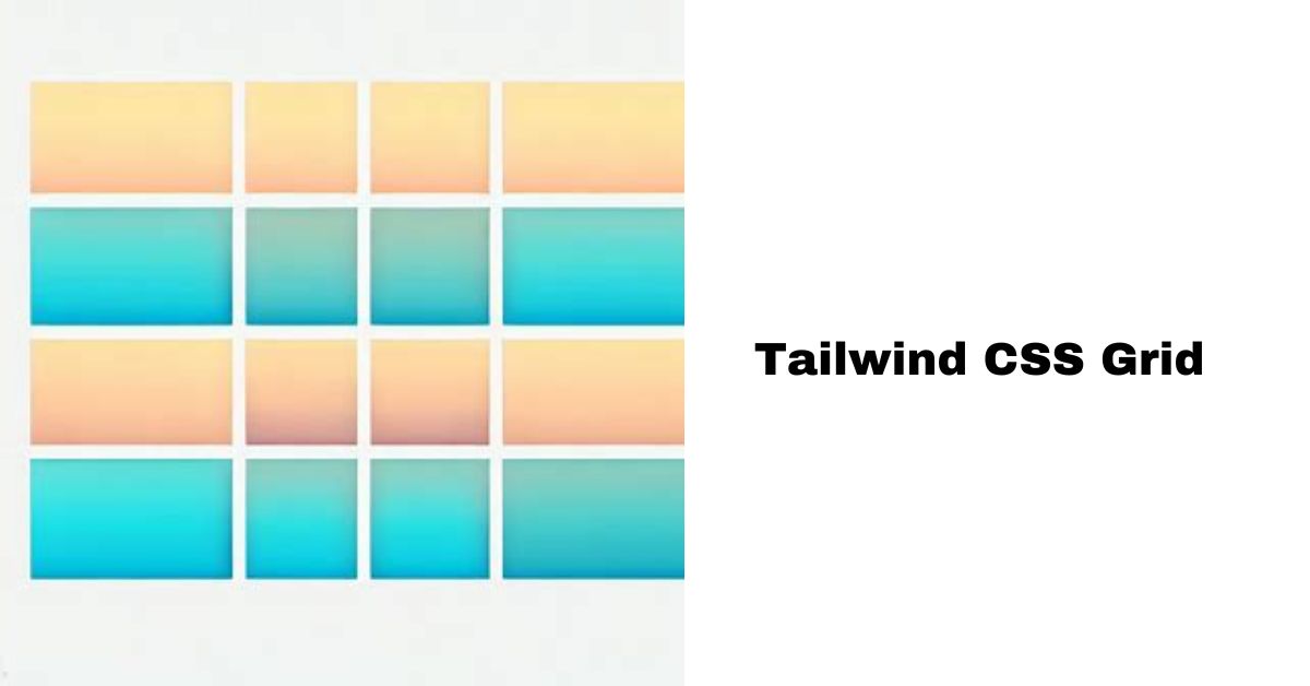
4. grid-cols-4 – Four Columns Grid
<div class="grid grid-cols-4">
  <!-- Your content here -->
</div>
This class creates a grid with four equally sized columns.
5. grid-cols-5 – Five Columns Grid
<div class="grid grid-cols-5">
  <!-- Your content here -->
</div>
This class creates a grid with five equally sized columns.
6. grid-cols-6 – Six Columns Grid
<div class="grid grid-cols-6">
  <!-- Your content here -->
</div>
This class creates a grid with six equally sized columns.
7. grid-cols-7 – Seven Columns Grid
<div class="grid grid-cols-7">
  <!-- Your content here -->
</div>
This class creates a grid with seven equally sized columns.
8. grid-cols-8 – Eight Columns Grid
<div class="grid grid-cols-8">
  <!-- Your content here -->
</div>
This class creates a grid with eight equally sized columns.
9. grid-cols-9 – Nine Columns Grid
<div class="grid grid-cols-9">
  <!-- Your content here -->
</div>
This class creates a grid with nine equally sized columns.
10. grid-cols-10 – Ten Columns Grid
<div class="grid grid-cols-10">
  <!-- Your content here -->
</div>
This class creates a grid with ten equally sized columns.
11. grid-cols-11 – Eleven Columns Grid
<div class="grid grid-cols-11">
  <!-- Your content here -->
</div>
This class creates a grid with eleven equally sized columns.
12. grid-cols-12 – Twelve Columns Grid
<div class="grid grid-cols-12">
  <!-- Your content here -->
</div>
This class creates a grid with twelve equally sized columns.
13. grid-cols-none – Custom Column Widths
<div class="grid grid-cols-none">
  <!-- Your content here -->
</div>
This class removes column sizing constraints, allowing you to define custom column widths using your own CSS.
Customizing Grid Column Widths
Tailwind CSS Grid empowers you to customize column widths beyond the predefined classes. Here are some examples:
Custom Column Widths
<div class="grid">
  <div class="col-custom">Custom Width</div>
  <div class="col-custom">Custom Width</div>
  <div class="col-custom">Custom Width</div>
</div>

<style>
  .col-custom {
    /* Define your custom column width here */
    width: 200px;
  }
</style>
In this example, we’ve created custom columns with a fixed width of 200 pixels. Adjust the width property to set your desired column width.
Fractional Column Widths
<div class="grid">
  <div class="col-fraction">1/4</div>
  <div class="col-fraction">1/4</div>
  <div class="col-fraction">2/4</div>
</div>

<style>
  .col-fraction {
    /* Use fractional units for flexible column widths */
    flex: 1;
  }
</style>
The col-fraction class creates flexible columns that share available space equally. In this example, the first two columns take up 1/4th of the available space each, while the third column occupies 2/4th or half of the space.
Column Spanning
<div class="grid">
  <div class="col-span-2">Span 2 Columns</div>
  <div class="col-span-3">Span 3 Columns</div>
</div>
You can use col-span-X classes to make columns span multiple grid columns. In this example, the first element spans two columns, and the second element spans three columns.
Customizing Grid Gaps
Tailwind CSS Grid also provides options for customizing the gaps between grid items:
<div class="grid gap-4">
  <div class="col-gap">Column 1</div>
  <div class="col-gap">Column 2</div>
  <div class="col-gap">Column 3</div>
</div>
In this example, we’ve added a custom gap of 4rem between grid items using the gap-4 class. Adjust the value to set your desired gap.
Responsive Design
Tailwind CSS Grid excels in creating responsive layouts. You can apply column variations and customizations within responsive breakpoints, ensuring your grid adapts to different screen sizes seamlessly:
<div class="grid md:grid-cols-2 lg:grid-cols-3">
  <!-- Your content here -->
</div>
In this example, we’ve defined different column
layouts for medium (md) and large (lg) screens. This responsive approach enhances the user experience on various devices.
Conclusion
Mastering Tailwind CSS Grid’s column variations and customizations empowers you to design sophisticated and responsive grid layouts for your web projects. Whether you need fixed-width columns, flexible fractional widths, or custom gaps, Tailwind CSS Grid provides the tools you need to create stunning layouts tailored to your requirements.
Experiment with these techniques, combine them with the predefined classes, and explore the endless possibilities of grid design. By doing so, you’ll elevate your web development skills and deliver visually impressive websites that adapt flawlessly to diverse screens and user preferences.
So, go ahead and unleash the full potential of Tailwind CSS Grid in your web development journey!

Arsalan Malik is a passionate Software Engineer and the Founder of Makemychance.com. A proud CDAC-qualified developer, Arsalan specializes in full-stack web development, with expertise in technologies like Node.js, PHP, WordPress, React, and modern CSS frameworks.
He actively shares his knowledge and insights with the developer community on platforms like Dev.to and engages with professionals worldwide through LinkedIn.
Arsalan believes in building real-world projects that not only solve problems but also educate and empower users. His mission is to make technology simple, accessible, and impactful for everyone.
Join us on dev community