|
Getting your Trinity Audio player ready... |
There are 7 types of web design
1. Responsive Web Design –
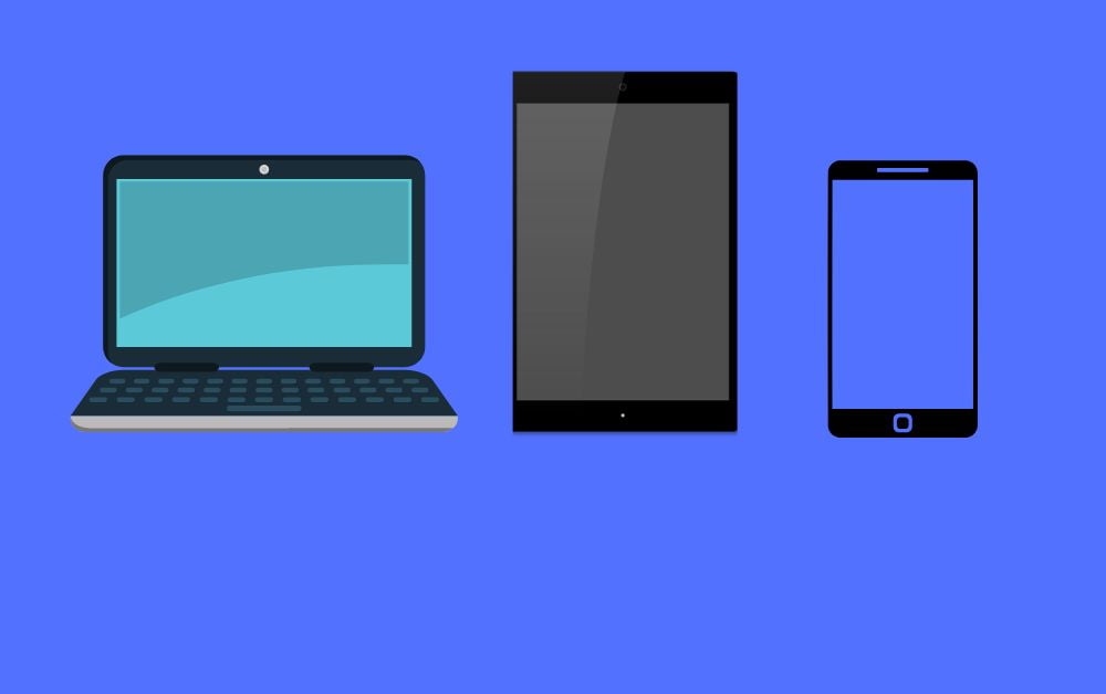
Responsive web design is the latest trend in web design. RWD uses flexible layouts that adapt to different screen sizes. A responsive website adjusts its layout based on the device being used to view it. In addition, RWD designs adjust their content automatically depending on the size of the viewing window.
What Is Tailwind CSS? How To Install Via npm?
How To Make
You can make responsive websites using HTML and CSS. If we want to make it responsive we need to use media queries on the header section of the site.
Use this code in the header section.
<meta name="viewport" content="width=device-width, initial-scale=1">Use media query on CSS according to size to size.
Media query example
@media screen and (max-width: 500px) {
.header a {
write your code...
}

.header-right {
write your code...
}
}
You can make RWD easily with bootstrap.
2. Ecommerce Web Design
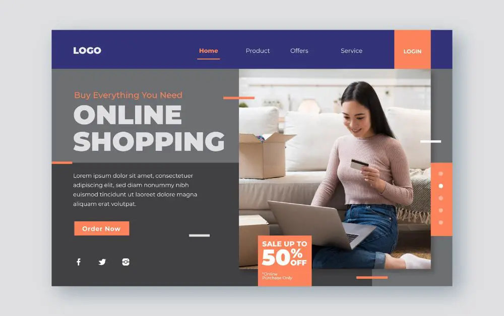
E-commerce web design is the process of creating a website that sells products online. A website designed for e-commerce should be well-designed, eye-catching, and easy to use. It should also include features that make it easy for customers to buy products online and keep track of their orders.
How To Make
Understanding What eCommerce is
E-commerce is the process of buying and selling products online. It can be divided into two main categories: online retail and e-commerce portals. Online retail refers to sales conducted through a retailer’s website, whereas e-commerce portals act as intermediaries between buyers and sellers.
Creating a website that looks good and is easy to use
Good eCommerce design should be visually appealing and easy to navigate. The layout should be simple, with scrolling pages that give users an overview of all products on the site at one glance.
The colors used should be eye-catching, but not too distractive, and the fonts should be legible without taking up too much space.
All buttons and other features should be clearly marked so that users know where to find them. In addition, all pages should load quickly, preventing frustrated customers from hitting “back” multiple times while they wait for your site to load.
Creating an efficient shopping experience
It is essential that your website provides an efficient shopping experience for users. This means creating pages that are optimized for search engines, grouping products by category or type, and making it easy to find the items they are looking for.
You also need to ensure that checkout processes are as fast and convenient as possible, avoiding long waiting times or frustrating errors during transactions.
Ensuring customer privacy
Your website must take customer privacy seriously at all times. This means ensuring that all personal data is protected from unauthorized access, encrypting data when sent over the internet, and providing clear guidelines on how customers can contact you if they have any questions or concerns about their data.
In addition, you should regularly review your internal processes to make sure they are secure and compliant with current regulations.
3. Minimalist Web Design-
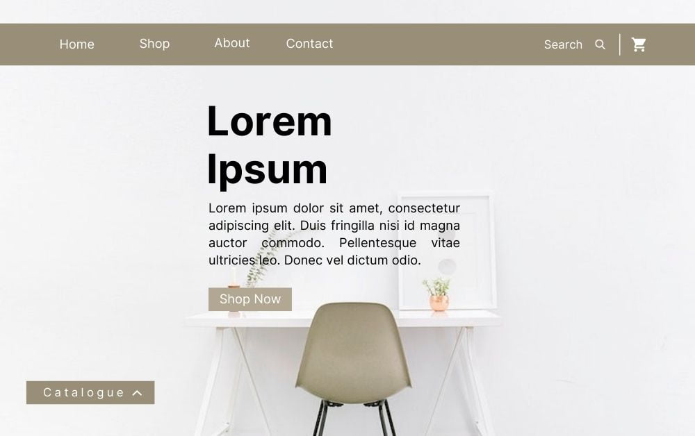
Minimalist web design focuses on keeping things simple and clean. There’s less clutter and fewer distractions. Users spend less time trying to figure out how to interact with a site and more time actually using it.
How To Make
- Use text sparingly
It’s easy to get carried away with images and graphics when designing a website. While these elements can certainly add visual appeal to a site, they take up valuable space on a page. If you have a lot of content to share, consider using images to highlight specific points instead of cluttering up the page with them. - Use white space
White space, sometimes called negative space, is the area between objects in a composition. White space makes a design look cleaner and crisper, and helps break up the page visually. In addition, it gives the viewer time to focus on the content rather than the design. - Keep navigation simple
Navigation should be kept simple. You don’t want to overwhelm visitors with a complicated menu system. Instead, opt for a few clear links that lead to the different sections of your site. - Don’t over-design
Just because something looks pretty doesn’t mean it’s functional. A well-designed page shouldn’t be cluttered with superfluous graphics or features. Stick to what works best and keep things clean and streamlined. - Be consistent
Consistency is key. Make sure the font size, color, and style of your headers match throughout your site. Also, maintain consistency in the way your navigation appears. - Minimize clutter
Avoid making your pages overly busy. Too much information can distract readers and slow down their browsing experience. When possible, use bullet lists and subheadings to organize your content. - Include a search bar
A search box is a great tool to help visitors find exactly what they’re looking for. Search engines like Google love sites that include a search bar, so make sure yours does!
4. One-Page Web Design –
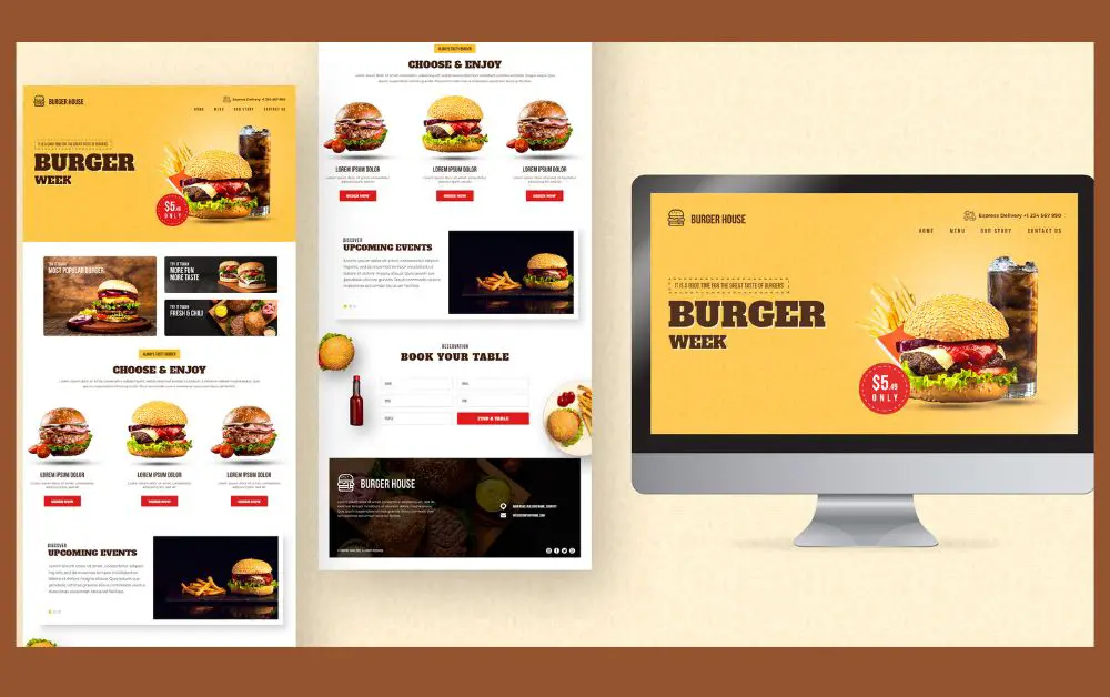
A one-page website is a website that fits all of its content onto a single webpage. Instead of clicking on links to navigate to different pages, a visitor to a one-page website scrolls down to see additional content.
One-page websites are often used for simple sites that don’t need a lot of content, or for sites that want to present their information in a streamlined, easy-to-digest format. They can be a good choice for small businesses, personal websites, or portfolios, as they can be quick and easy to create and maintain.
One-page websites typically have a fixed navigation bar at the top of the page, which allows visitors to quickly jump to different sections of the page by clicking on the links in the navigation menu.
Some one-page websites also have smooth scrolling effects, so that when a visitor clicks on a link in the navigation menu, the page smoothly scrolls down to the relevant section.
One-page websites can be created using a variety of tools, including website builders, content management systems (CMS), or by hand-coding the HTML, CSS, and JavaScript. It’s important to carefully plan the content and design of a one-page website to ensure that it is easy to navigate and provides a good user experience.
How To Make
- Plan your content: you will need to decide what content you want to include on your one-page website. This might include information about your business or personal brand, your products or services, your contact information, and any other relevant details. It’s important to plan your content carefully to ensure that it is organized and easy to understand.
- Design your website: Once you have planned your content, you can start designing your website. This might include choosing a color scheme, layout, and font, as well as creating any graphics or images that you want to include.
- Build your website: There are several ways that you can build your one-page website, depending on your skills and resources. If you have experience with HTML, CSS, and JavaScript, you can hand-code your website using a text editor. Alternatively, you can use a website builder or content management system (CMS) to create your website more easily.
5. Illustration Web Design –
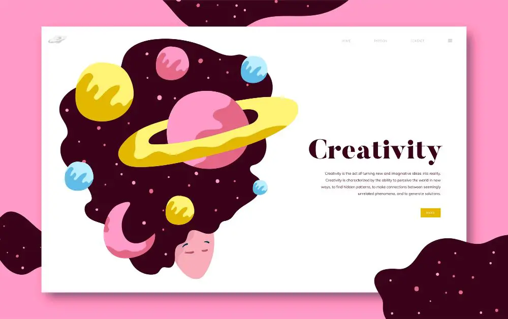
A design approach that uses illustrations and other visual elements to convey information and create a cohesive look and feel.
How To Make
- Decide on the purpose and style of the illustration. Consider what message or emotion you want to convey, and choose a style that will best communicate this.
- Gather reference material. This can include images, color palettes, and examples of similar illustrations.
- Sketch out the illustration. This can be done by hand or using a digital tool like Procreate or Adobe Illustrator.
- Refine the sketch and add color. Use the reference material to help guide your choices, and be sure to consider how the illustration will look in different sizes and on different devices.
- Save the illustration in a web-friendly format, such as PNG or SVG. These formats will allow the illustration to be displayed clearly on the web.
- Add the illustration to your web design using HTML and CSS. You can use the
imgtag to insert the illustration into an HTML page and use CSS to control its size and positioning.
It’s a good idea to test the illustration on different devices and browsers to ensure that it looks as intended. You may also want to consider optimizing the file size of the illustration to ensure that it loads quickly on the web.
6. Material Design –
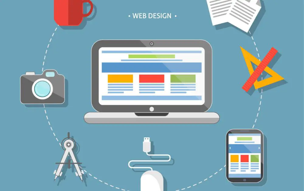
Material web design is a practice where design elements are built using software instead of traditional means like typefaces, colors, and images. In recent years material design has become increasingly popular among designers due to its unique style and approach to user interaction. There have been a number of successful companies that have adopted material design including Android, Google Play, and Google Chrome.
How To Make
Material design is a style of user interface (UI) design that was introduced by Google in 2014. It focuses on simplicity, legibility, and utility. There are three core principles of material design:
- Minimalism: Keep things simple and clean.
- Paper: Use paper textures and typography to create a sense of tactile experience.
- Color: Use color in harmony with the content.
Material design is based on two main principles: - Flexible grids
- Contrasting colors
The flexible grid system is used to organize information across different screen sizes. In mobile devices, the grid will expand to fill the entire width of the page, while in desktop computers, the grid will collapse to a single column.
Contrasting colors are used to highlight important elements of the UI. These contrasting colors are used to provide visual hierarchy and improve readability.
7. Search Engine Optimization (SEO) Web Design –
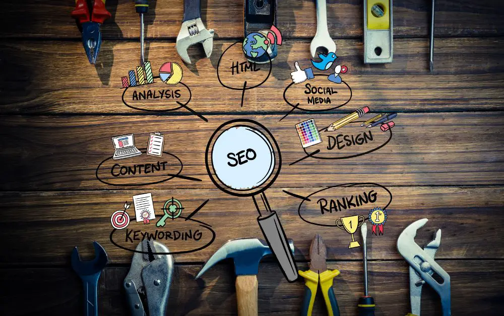
Search engine optimization (SEO) involves making changes to a website that help search engines find it. SEO focuses primarily on how the website is presented to human visitors; however, some SEO techniques do affect how search engines index and rank the website.
How To Make
- Keywords
Keywords are words or phrases that people use to find information online. When someone searches for a term on Google, they type in a few keywords and then click “search”. If your website contains these keywords, it will appear higher in search results than websites without them. Make sure that your website includes relevant keywords. Search engines love websites that have content about what they are looking for. - Content
Content is king! Your website should have good quality content that is informative and useful. A lot of websites focus on flashy graphics and videos instead of providing valuable information. You want to provide helpful information that visitors can take away. - Links
Links are the bread and butter of SEO. Linking back to your site from other sites helps Google determine how reputable the site is. Good links increase your chances of appearing high in search results. - Meta Tags
Meta tags are hidden text boxes that tell search engine spiders what your website is about. These tags help search engines understand what your page is about. - Images
Images are a great way to add interest to your pages. Use images to highlight specific features of your product and show off your best work. - HTML Codes
HTML stands for Hyper Text Markup Language. It is the language that web developers use to create web pages. HTML codes make your website look professional and organized. - Page Load Time
Page load time is the amount of time it takes for a visitor to view your webpage. Longer page load times mean lower rankings. Pages that load fast get better rankings than those that don’t.
What is Best Chocolate Website Design?

Arsalan Malik is a passionate Software Engineer and the Founder of Makemychance.com. A proud CDAC-qualified developer, Arsalan specializes in full-stack web development, with expertise in technologies like Node.js, PHP, WordPress, React, and modern CSS frameworks.
He actively shares his knowledge and insights with the developer community on platforms like Dev.to and engages with professionals worldwide through LinkedIn.
Arsalan believes in building real-world projects that not only solve problems but also educate and empower users. His mission is to make technology simple, accessible, and impactful for everyone.
Join us on dev community
