
|
Getting your Trinity Audio player ready...
|
Viewports and Flexibility
Setting the viewport correctly is fundamental for responsive web design. The viewport meta tag adjusts the layout to fit various device widths, preventing overflow issues on smaller screens.
To keep images within containers, use the max-width property. This limits images to fit predetermined boundaries while maintaining aspect ratios with height: auto. Using multiple pre-scaled sources within picture and source elements enhances adaptability across devices.
For responsive typography, the vw unit allows font sizes to adjust dynamically as the viewport changes. The clamp() function can set minimum and maximum font sizes to prevent headings from becoming too small or large.
The text-wrap property with values like balance and pretty helps distribute line lengths evenly, creating an aesthetically pleasing text flow.
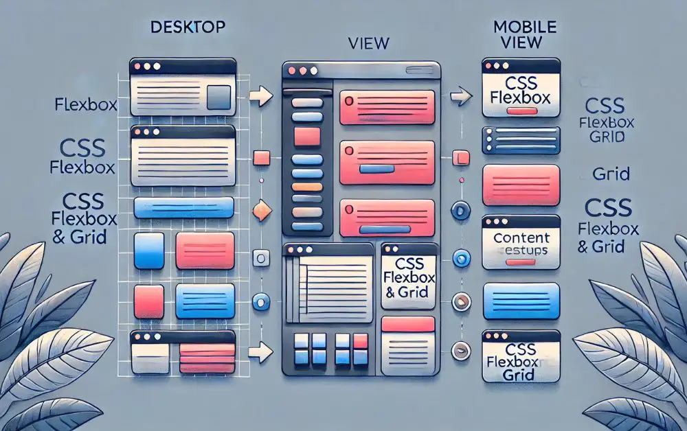
Flexbox and CSS Grid add flexibility without media queries. For example, using display: grid with grid-template-columns: repeat(auto-fill, minmax(200px, 1fr)) creates adaptable grids that adjust column numbers based on available space.
Using CSS Layouts Effectively
Flexbox and Grid layouts in CSS offer tools for creating flexible, component-based layouts that naturally adjust to screen size without heavy reliance on media queries.
- Flexbox: Excels at handling alignment and space distribution within containers, making it ideal for one-dimensional layouts. Properties like
flex-wrap,justify-content, andalign-itemscreate dynamic arrangements that adapt to screen width changes. - Grid layouts: Offer two-dimensional capabilities for complex designs. The
auto-fillandminmaxfunctions allow grids to fill available space, adjusting item numbers per row as screen size changes. - Multi-column layouts: Offer a simpler method for displaying content in newspaper-style formats, particularly useful for text-heavy content.
Handling Text Responsiveness
The text-wrap property helps address issues like dangling words or uneven line breaks:
text-wrap: balanceevens out line lengths within text blocks, maintaining pleasing structures regardless of viewport width. This benefits smaller chunks of centered text.text-wrap: prettyis useful for longer paragraphs. It moves the last word of the second-to-last line to join an orphaned last line, keeping text fluid and continuous.
It’s important to consider computational demands and browser support for these properties. Testing across different environments is advisable.
Adopting adaptive techniques and thoughtful CSS strategies allows developers to create seamless user experiences across devices. Focusing on responsive elements ensures every visitor enjoys a polished interaction with digital content.
- Parmentier R. Coding responsive emails without media queries. 2016.
- Merlin N. Responsive email without media queries. Email Developer.

Arsalan Malik is a passionate Software Engineer and the Founder of Makemychance.com. A proud CDAC-qualified developer, Arsalan specializes in full-stack web development, with expertise in technologies like Node.js, PHP, WordPress, React, and modern CSS frameworks.
He actively shares his knowledge and insights with the developer community on platforms like Dev.to and engages with professionals worldwide through LinkedIn.
Arsalan believes in building real-world projects that not only solve problems but also educate and empower users. His mission is to make technology simple, accessible, and impactful for everyone.
Join us on dev community