|
Getting your Trinity Audio player ready... |
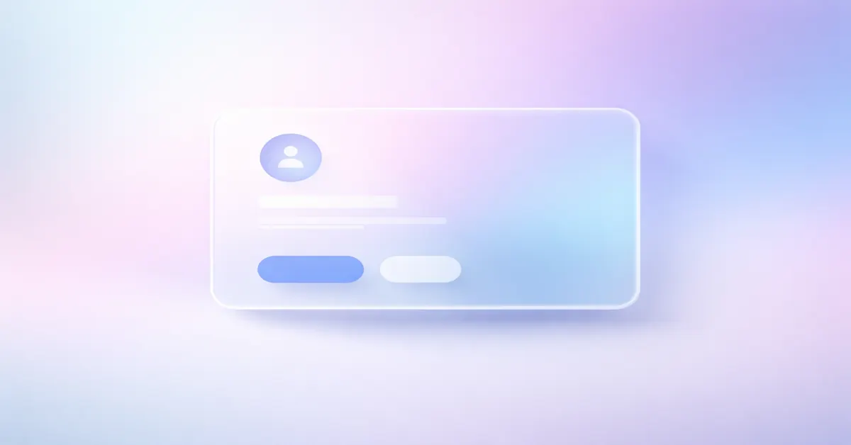
Glassmorphism UI is a modern interface design pattern that uses background blur, transparency, and layered depth to simulate a frosted-glass effect. In 2026, it remains relevant due to its adoption in operating systems, SaaS dashboards, and high-end web products.
What Defines Glassmorphism UI
Glassmorphism relies on a small set of visual and technical principles:
- Background blur using CSS
backdrop-filter - Semi-transparent surfaces with low-opacity fills
- Thin borders to separate layers
- Soft shadows for depth
- High-contrast or colorful backgrounds
This style was popularized by Apple’s macOS UI, Microsoft Fluent Design, and modern fintech interfaces.
Why Glassmorphism Still Works in 2026
Glassmorphism aligns well with current design requirements:
- Clean visual hierarchy
- Minimalist layouts
- Premium look for digital products
- Strong engagement on visual platforms like Google Discover
It is widely used in SaaS tools, AI dashboards, analytics platforms, and mobile apps where visual clarity matters more than dense content.
Glassmorphism vs Neumorphism
| Factor | Glassmorphism | Neumorphism |
|---|---|---|
| Accessibility | Medium–High (with contrast control) | Low |
| Performance | GPU-heavy if overused | Lightweight |
| Industry adoption | High | Declining |
| Real-world usability | Practical | Limited |
Neumorphism struggled with accessibility compliance, while Glassmorphism evolved with clearer contrast rules.
CSS Example: Glassmorphism Card
.glass {
  background: rgba(255, 255, 255, 0.15);
  backdrop-filter: blur(12px);
  -webkit-backdrop-filter: blur(12px);
  border: 1px solid rgba(255, 255, 255, 0.3);
  box-shadow: 0 8px 32px rgba(0, 0, 0, 0.2);
  border-radius: 16px;
}
Supported in all modern Chromium browsers and Safari. Firefox requires experimental flags.
Performance and Core Web Vitals
Improper use of Glassmorphism can affect performance metrics:
- Heavy blur layers increase GPU load
- Large glass containers can impact LCP
- Multiple overlapping layers increase paint cost
Best practices:
- Avoid blur on LCP elements
- Limit glass effects to UI cards
- Use static backgrounds
- Test on low-end devices
When optimized, Glassmorphism passes Core Web Vitals safely.
When Glassmorphism Should Be Avoided
- Content-heavy blogs
- Accessibility-first websites
- Government or public-service portals
- Pages targeting ultra-fast mobile LCP
Glassmorphism is a visual enhancement, not a layout foundation.
Final Verdict
Glassmorphism UI is no longer experimental. In 2026, it is a controlled, performance-aware design technique best suited for modern digital products. When used selectively, it improves perceived quality without compromising usability.
Arsalan Malik is a passionate Software Engineer and the Founder of Makemychance.com. A proud CDAC-qualified developer, Arsalan specializes in full-stack web development, with expertise in technologies like Node.js, PHP, WordPress, React, and modern CSS frameworks.
He actively shares his knowledge and insights with the developer community on platforms like Dev.to and engages with professionals worldwide through LinkedIn.
Arsalan believes in building real-world projects that not only solve problems but also educate and empower users. His mission is to make technology simple, accessible, and impactful for everyone.
Join us on dev community