|
Getting your Trinity Audio player ready... |
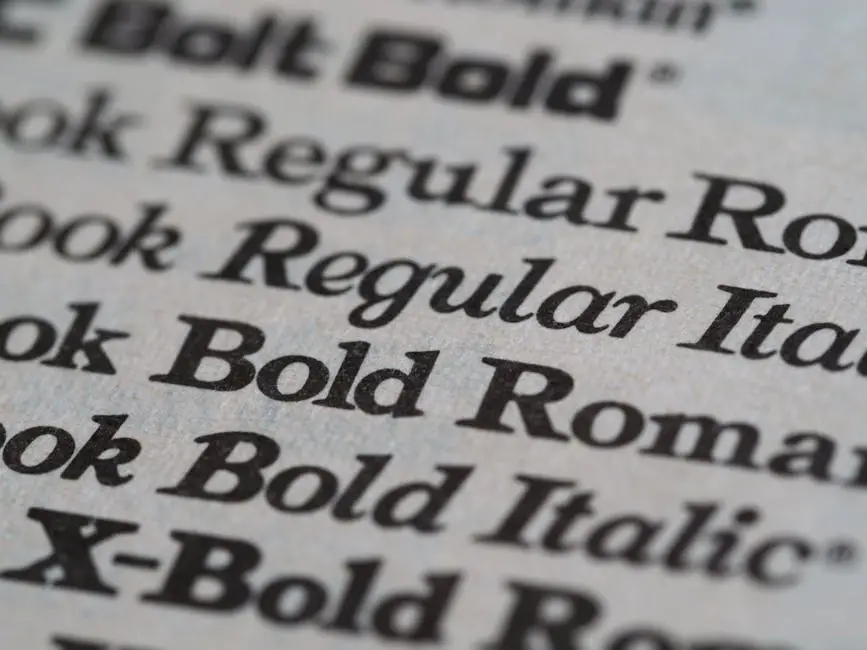
Understanding Typeface vs. Font
Typefaces and fonts are distinct concepts in typography:
- Typeface: A collection of fonts sharing a common design (e.g., Helvetica)
- Font: A specific style within a typeface (e.g., Helvetica Bold Italic)
Understanding this difference helps designers make more informed choices. Choosing the right typeface sets the tone for your design. For example:
- Times New Roman conveys formality
- Comic Sans is more casual
Consider your text’s purpose when selecting a typeface. Sans serif fonts like Arial or Verdana are often preferred for screen readability, especially in longer paragraphs. Serif fonts can add elegance to a design.
Ensure your chosen typeface is legible at various sizes. Test fonts at different scales to confirm they work well in all contexts. When combining typefaces, aim for contrast while maintaining harmony. Use no more than two or three typefaces in a design to keep it cohesive.
Remember: Typefaces may appear differently across print and digital platforms. Choose fonts that perform well in both mediums to maintain consistency.
Key Categories of Typefaces
There are three main categories of typefaces:
- Serif: Have small lines or strokes at the ends of characters. Often convey tradition and elegance, making them popular for print media like books and newspapers.
- Sans serif: Lack extra strokes, resulting in a clean, minimalist look. Often used in digital design and for body text on screens due to their readability.
- Decorative or display: More stylized and unique. Best used sparingly for headlines or special design elements, as overuse can affect readability.
Each category serves different purposes in design. Choosing the right typeface category depends on your project’s needs and intended message.
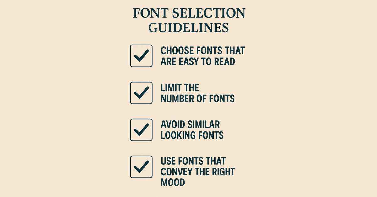
Considerations for Typeface Selection
When selecting a typeface, consider the following factors:
- Scope: Determine if the typeface will be used for a one-time project or as part of a long-term brand identity. This affects whether you need a versatile font family or can opt for a more specialized choice.
- Mood: Choose a typeface that aligns with your project’s tone, whether formal, casual, or somewhere in between.
- Functionality: Ensure the typeface works well in its intended use, whether for headlines, body text, or both. Consider how it performs in different sizes and formats.
- Readability: Prioritize legibility, especially for body text. Avoid overly decorative fonts that might hinder comprehension.
By considering these factors, you can select a typeface that effectively supports your design goals and communicates your message clearly.
Font Pairing Techniques
Effective font pairing enhances the visual appeal and readability of your design. Here are some techniques to consider:
- Create contrast: Pair fonts with different characteristics, such as a serif header with a sans serif body text.
- Limit your selection: Use no more than two or three typefaces in a design to maintain cohesion.
- Use font families: Utilize different weights and styles within the same typeface family for subtle variation.
- Assign clear roles: Use distinct fonts for different elements like titles, subheadings, and body text.
- Balance creativity and readability: While you can experiment with unique pairings, ensure the overall design remains legible and functional.
By applying these techniques, you can create visually appealing designs that effectively communicate your message.
Understanding the difference between typefaces and fonts, along with effective selection and pairing techniques, allows designers to create more impactful and cohesive visual communications.
This article was written by Writio.
- Typographic anatomy. Canva Learn.
- Glossary of typographic terms and compositional techniques. Canva Learn.
- Canva Learn’s list of 30 font combinations. Canva Learn.
- Choosing a typeface. Practical Typography.
- How to choose a typeface. Creative Bloq.

Arsalan Malik is a passionate Software Engineer and the Founder of Makemychance.com. A proud CDAC-qualified developer, Arsalan specializes in full-stack web development, with expertise in technologies like Node.js, PHP, WordPress, React, and modern CSS frameworks.
He actively shares his knowledge and insights with the developer community on platforms like Dev.to and engages with professionals worldwide through LinkedIn.
Arsalan believes in building real-world projects that not only solve problems but also educate and empower users. His mission is to make technology simple, accessible, and impactful for everyone.
Join us on dev community