|
Getting your Trinity Audio player ready... |
Have you ever built a flexbox layout and felt like your elements were fighting for space? 😤 Maybe one div stubbornly sticks to its original size while others awkwardly shrink or overflow? If you’ve been there, it’s time to introduce yourself to the powerful little CSS property: **flex-grow**.
Let’s break it down like we’re chatting over chai (or coffee ☕️).
🤔 What is flex-grow?
In short, flex-grow tells a flex item how much space it should take up compared to its siblings inside a flex container.
Imagine you and two friends are splitting a pizza 🍕. If you say “I’m really hungry,” and they’re like “meh,” then you should get a bigger slice, right? That’s flex-grow in action.
.item {
  flex-grow: 1;
}
It tells the browser: “Hey, I’m okay expanding if there’s room.”
📦 The Default Behavior
By default, flex-grow is set to 0, which means: “Don’t grow me, I like my size as it is.”
.item {
  flex-grow: 0; /* Default */
}
All items will stay at their intrinsic size, no matter how much space is left.
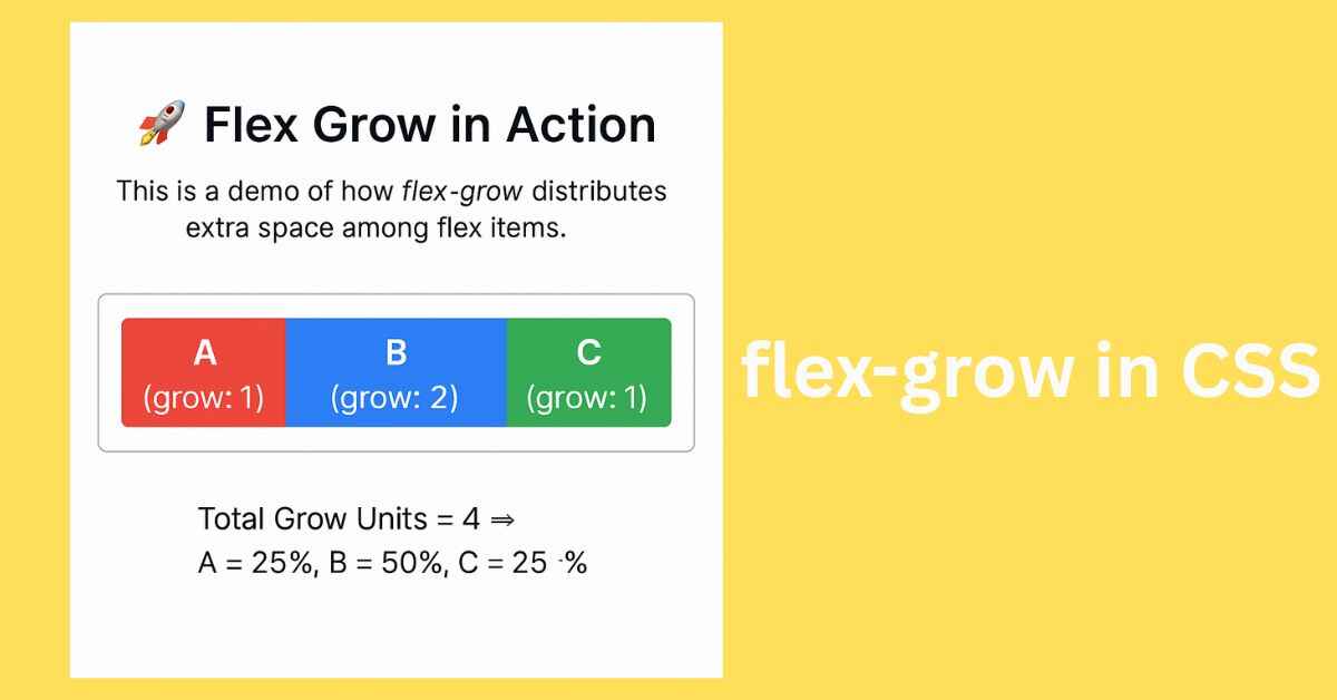
🔥 Real-Life Example
Let’s say you have three flex items:
<div class="container">
  <div class="box a">A</div>
  <div class="box b">B</div>
  <div class="box c">C</div>
</div>
.container {
  display: flex;
}
.a {
  flex-grow: 1;
}
.b {
  flex-grow: 2;
}
.c {
  flex-grow: 1;
}
This means:
.bwill take twice as much space as.aand.c.- Total grow units = 1 + 2 + 1 = 4
- So space distribution:
.a= 25%.b= 50%.c= 25%
Isn’t that neat? 🙌
See the Pen Untitled by Arsalan malik (@Arsalan-malik-the-builder) on CodePen.
💡 Why Use flex-grow?
✅ Make responsive layouts
✅ Avoid hardcoded widths
✅ Let elements adapt to space
✅ Say goodbye to complicated media queries (in many cases)
⚠️ Gotchas to Watch Out For
🔸 flex-grow only works inside a flex container
🔸 Works relative to siblings — not absolute pixels
🔸 Combine it wisely with flex-shrink and flex-basis for full control
🎯 TL;DR (Too Lazy? Don’t Worry 😄)
flex-grow = how much an item should stretch to fill space.
0 → don’t grow
1+ → grow proportionally
💬 What’s Your Flex Game Like?
Do you use flex-grow in your layouts? Or still leaning on floats and margins? Share your favorite tricks or common flex mistakes below 👇
Let’s make CSS less scary—one property at a time.
Originally published on Makemychance.com 🚀

Arsalan Malik is a passionate Software Engineer and the Founder of Makemychance.com. A proud CDAC-qualified developer, Arsalan specializes in full-stack web development, with expertise in technologies like Node.js, PHP, WordPress, React, and modern CSS frameworks.
He actively shares his knowledge and insights with the developer community on platforms like Dev.to and engages with professionals worldwide through LinkedIn.
Arsalan believes in building real-world projects that not only solve problems but also educate and empower users. His mission is to make technology simple, accessible, and impactful for everyone.
Join us on dev community