|
Getting your Trinity Audio player ready... |
Originally published on Makemychance.com
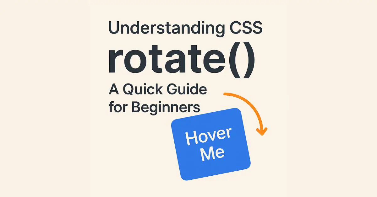
The rotate() function is part of the CSS Transform Module, allowing you to rotate an element clockwise or counterclockwise by a specified angle. It’s often used with the transform property.
Syntax:
transform: rotate(angle);
Example:
.box {
  transform: rotate(45deg);
}
This rotates the .box element 45 degrees clockwise.
🛠️ Accepted Units
deg– degrees (most commonly used)rad– radiansgrad– gradiansturn– full turns
transform: rotate(0.5turn); /* 180 degrees */
📱 Use Cases of rotate()
- Rotating icons on hover
- Creating spinner animations
- Adding subtle tilt effects
- Rotating text for creative design
- Responsive card flips or carousel components
🚀 Real-Life Example with Hover Effect
<style>
.button {
  transition: transform 0.3s ease-in-out;
}
.button:hover {
  transform: rotate(15deg);
}
</style>

<button class="button">Hover Me</button>
This makes the button tilt slightly when hovered — simple and elegant.
⚠️ Things to Keep in Mind
1. Use will-change for Performance
If you’re applying rotate() frequently (like in animations), use will-change: transform to hint the browser:
.box {
  will-change: transform;
}
2. Combine with Other Transforms Carefully
When combining rotate() with scale(), translate(), etc., the order matters.
transform: translateX(50px) rotate(30deg);
3. Don’t Rotate Text Excessively
Too much rotation hurts readability, especially on mobile. Keep UX in mind.
🌐 Browser Compatibility
All modern browsers support rotate().
✅ Chrome
✅ Firefox
✅ Safari
✅ Edge
✅ Opera
✍️ Final Thoughts
CSS rotate() is a small function with big visual impact. Whether you’re creating micro-interactions or dynamic animations, it gives your design a modern edge. But always prioritize performance and user experience.
Want more CSS tricks like this? Visit Makemychance.com for tutorials that actually help.
✅ Action Tip: Try rotating an image or icon on hover in your next project — you’ll love the effect!
Arsalan Malik is a passionate Software Engineer and the Founder of Makemychance.com. A proud CDAC-qualified developer, Arsalan specializes in full-stack web development, with expertise in technologies like Node.js, PHP, WordPress, React, and modern CSS frameworks.
He actively shares his knowledge and insights with the developer community on platforms like Dev.to and engages with professionals worldwide through LinkedIn.
Arsalan believes in building real-world projects that not only solve problems but also educate and empower users. His mission is to make technology simple, accessible, and impactful for everyone.
Join us on dev community
