|
Getting your Trinity Audio player ready... |
CSS masonry is a type of layout where items are stacked vertically in columns, filling gaps naturally. Instead of a straight grid with equal-sized cells, masonry arranges elements in columns so that space is used efficiently. Items stay tight against each other even if they’re different heights.
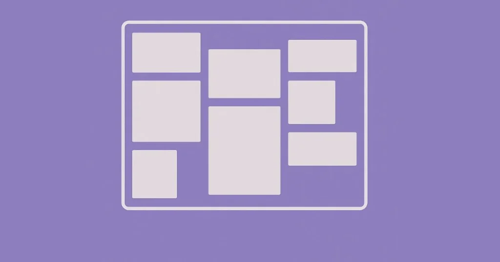
Traditional grid and flexbox are great for many layouts, but they don’t always handle content of different sizes well. Masonry adjusts to these variations, giving your site a more dynamic look. It’s perfect for galleries, blog feeds, and online shops with lots of varied content.
Benefits of Using Masonry Layouts
- Your content looks more engaging and spontaneous.
- Space is used smartly, reducing wasted gaps.
- It adapts to different screen sizes and content types.
- You can mimic popular platforms like Pinterest easily.
- It keeps visitors hooked longer as they scan through varied visuals.
CSS Masonry Techniques and Methods
Using CSS Columns
CSS columns are simple and effective for creating masonry effects. You set a fixed number of columns, and the browser stacks content vertically, flowing down each column.
How it works:
- Use
column-countorcolumn-width. - Style your container with
columns: 3 auto;to split content into three columns. - Items auto-flow from top to bottom in each column.
Implementation tips:
- Add spacing with
column-gap. - Watch out for uneven columns, especially with dynamic content.
- Not all browsers support advanced features perfectly.
CSS Grid Approach
CSS Grid provides more control over layout. By combining grid-auto-rows and grid-template-rows, you can imitate masonry.
How it works:
- Define a grid with flexible row sizes.
- Use JavaScript to adjust row spans based on content height.
- Or, manually assign grid lines to fit content.
Benefits:
- Precise control over each item’s placement.
- Easier to create complex responsive designs.
Limitations:
- Slightly more complex to set up.
- Current browser support for some methods might need fallback strategies.
Flexbox Method
Flexbox creates a more flexible layout but isn’t native for masonry. It relies on wrapping items and adjusting their order.
How it’s done:
- Use
display: flex; flex-wrap: wrap;. - Assign widths for items.
- Use JavaScript to manage uneven heights or use multi-column trickery.
Challenges:
- Columns may not stay perfectly aligned.
- Requires extra scripting for best results.
Modern JavaScript Solutions
Pure CSS can sometimes fall short. Libraries like Masonry.js or Isotope combine CSS with JavaScript to make layouts more dynamic.
When to opt for JavaScript:
- Content loads asynchronously.
- You need advanced filtering or sorting.
- Compatibility issues are significant.
JavaScript solutions offer more flexibility and control but may impact page load times.
Best Practices for Creating Responsive Masonry Layouts
Responsiveness Techniques
You want your layout to look good on a phone, tablet, and desktop. Use media queries to change the number of columns or gaps based on screen size. Combine CSS columns, grid, or flexbox with media queries for the best result.
Accessibility Considerations
Make sure everyone can access your content:
- Use semantic HTML tags like
<section>,<article>, and<figure>. - Provide alt text for images.
- Enable keyboard navigation so users can browse easily.
Performance Optimization
Site speed influences user experience. Minimize layout shifts by:
- Setting size attributes for images.
- Using lazy loading for off-screen images.
- Avoiding excessive JavaScript that delays rendering.
Cross-Browser Compatibility
Test your layout in Chrome, Firefox, Safari, and Edge. Use fallback options like traditional grids if some browsers don’t support certain CSS features. Keep your code simple so it’s resilient across environments.
Advanced Tips and Tricks
Combining CSS Masonry with Other Layouts
Create unique designs by mixing flexbox with grid or columns. For example, use a flexbox header with a masonry grid below. Mixing layout types helps craft more complex pages.
Customizing Spacing and Gaps
Adjust gaps with column-gap, grid-gap, or gap properties. Experiment to find a balance that looks clean and uncluttered.
Handling Dynamic Content
When content loads asynchronously, layouts can shift. Use JavaScript to trigger recalculations or placeholders until all items are ready. This keeps your site smooth and professional.
SEO Implications
Masonry doesn’t interfere with SEO if you use semantic tags and accessible images. Keep important content in HTML so search engines can read it. Use ARIA roles for clarity.
Conclusion
CSS masonry gives your website a fresh, dynamic style. Whether you choose CSS columns, grid, flexbox, or a JavaScript library, each method has benefits. The key is to match your layout method to your project needs.
Responsive design and accessibility matter most in today’s web. Use best practices, optimize for speed, and test across browsers. Experiment with different techniques to find what works best for your content.
Stay updated on new CSS features and browser support. With a little practice, you can craft stunning, Pinterest-like layouts that wow visitors and elevate your site. Give masonry a try on your next project — the possibilities are endless.

Arsalan Malik is a passionate Software Engineer and the Founder of Makemychance.com. A proud CDAC-qualified developer, Arsalan specializes in full-stack web development, with expertise in technologies like Node.js, PHP, WordPress, React, and modern CSS frameworks.
He actively shares his knowledge and insights with the developer community on platforms like Dev.to and engages with professionals worldwide through LinkedIn.
Arsalan believes in building real-world projects that not only solve problems but also educate and empower users. His mission is to make technology simple, accessible, and impactful for everyone.
Join us on dev community
![Solving "Deprecation Warning [legacy-js-api]" in Dart Sass While Building a React Project](https://makemychance.com/wp-content/uploads/2025/05/deprecation-warning-legacy-js-api-in-dart-sass-150x150.jpg)