|
Getting your Trinity Audio player ready... |
The em unit in CSS is a relative length unit. It scales based on font size and is widely used for responsive typography and spacing. This article explains em clearly, with tables and real-world behavior.
What is em in CSS?
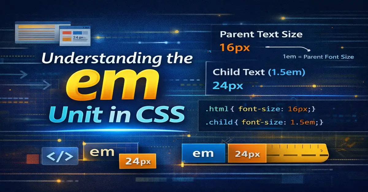
em is a relative unit that calculates its value based on the font-size of the current element.
If you are new to styling, first understand CSS basics.
p {
  font-size: 1.2em;
}
If the parent font-size is 16px, then 1.2em = 19.2px.
How em is Calculated
| Context | Base Size |
|---|---|
font-size | Parent element font-size |
margin/padding | Element’s own font-size |
| Nested elements | Cascading calculation |
em vs px
| Feature | em | px |
|---|---|---|
| Responsive | Yes | No |
| Relative | Yes | No |
| Scales with font | Yes | No |
| Fixed size | No | Yes |
Example: Basic Usage
body {
  font-size: 16px;
}

h1 {
  font-size: 2em; /* 32px */
}
Nested em Problem (Important)
em compounds when elements are nested.
.parent {
  font-size: 1.25em;
}

.child {
  font-size: 1.2em;
}
| Element | Calculated Size |
|---|---|
| Parent | 20px |
| Child | 24px |
This is why em must be used carefully.
em vs rem
| Feature | em | rem |
|---|---|---|
| Reference | Parent | Root (html) |
| Nesting effect | Yes | No |
| Predictability | Medium | High |
If you want stable scaling, read CSS rem unit.
Using em for Spacing
em is not limited to text.
.button {
  padding: 0.5em 1em;
}
| Benefit | Reason |
|---|---|
| Scales with text | Better accessibility |
| Component-based | Flexible UI |
Best Practices for em
| Rule | Why |
|---|---|
Use em for components | Local scaling |
| Avoid deep nesting | Prevent compounding |
Use rem for layout | Predictable |
| Test zoom behavior | Accessibility |
Common Mistakes
| Mistake | Impact |
|---|---|
Mixing em everywhere | Hard to debug |
| Deep nesting | Unexpected sizes |
| Using for full layouts | Unstable |
When to Use em
| Use Case | Recommendation |
|---|---|
| Buttons | Yes |
| Forms | Yes |
| Typography | Yes |
| Page layout | No |
Performance & Accessibility
| Aspect | Result |
|---|---|
| Browser zoom | Works well |
| Font scaling | Natural |
| CLS impact | Minimal |
Final Notes
em is powerful but context-sensitive. Use it for components and spacing tied to text. For layouts and global control, prefer rem.
Understanding em correctly prevents layout bugs and improves accessibility.

Arsalan Malik is a passionate Software Engineer and the Founder of Makemychance.com. A proud CDAC-qualified developer, Arsalan specializes in full-stack web development, with expertise in technologies like Node.js, PHP, WordPress, React, and modern CSS frameworks.
He actively shares his knowledge and insights with the developer community on platforms like Dev.to and engages with professionals worldwide through LinkedIn.
Arsalan believes in building real-world projects that not only solve problems but also educate and empower users. His mission is to make technology simple, accessible, and impactful for everyone.
Join us on dev community