|
Getting your Trinity Audio player ready... |
Understanding CSS Cursor Property
The cursor CSS property affects user experience as they interact with webpage elements. It signals possible actions through visual cues. By adjusting cursor type, developers can indicate if an element is clickable, selectable, or interactive.
The syntax is straightforward: cursor: value;. Each cursor setting typically uses a keyword or URL to a custom image. For example: cursor: url(custom.cur), pointer;.
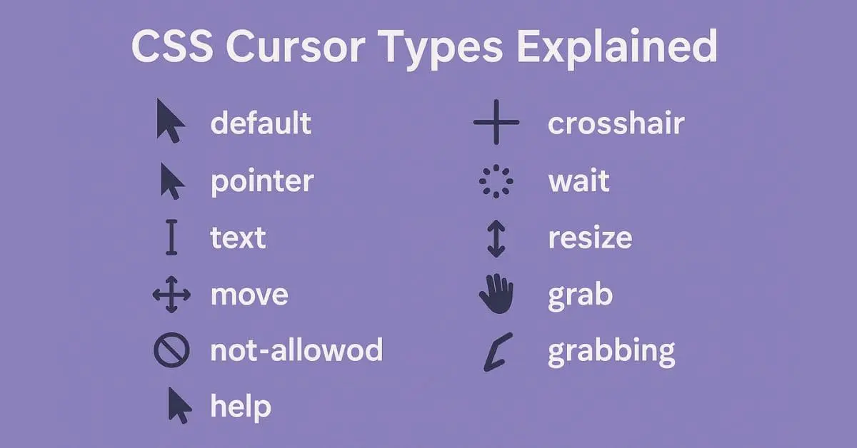
Common options include:
- auto: Browser-determined cursor based on context.
- pointer: Hand icon for links.
- text: I-beam shape for text fields.
- wait: Spinner or hourglass for loading states.
- help: Question mark for information.
Resizing cursors include directional options like n-resize, s-resize, e-resize, w-resize, and diagonal variants.
Custom cursor images allow for personalized pointers, with keyword fallbacks. When using URL images, x and y coordinates can specify the cursor's focus point.
Other types include:
- alias: For creating shortcuts.
- copy: For duplicating content.
- no-drop: Crossed circle for invalid drop targets.
The cursor property guides user interactions through visual cues, enhancing overall navigation and usability.
Types of Cursors and Their Use Cases
CSS cursor types serve different purposes in user interface design:
General:
- auto: Adapts based on context.
- default: Standard arrow pointer.
Links and Status:
- pointer: Hand icon for clickable elements.
- progress: Indicates background processes.
- wait: Encourages pausing during loading.
- help: Offers guidance with a question mark.
Selection:
- text: I-beam for editable areas.
- vertical-text: For vertical text sections.
- crosshair: For precise selections or design interfaces.
Drag and Drop:
- move: Indicates draggable items.
- copy: Signifies content duplication.
- no-drop and not-allowed: Prevent misplaced items.
Resizing:
- col-resize and row-resize: For adjustable dimensions.
- Directional variants like n-resize, e-resize, etc.
Zooming:
- zoom-in and zoom-out: For view control.
Each cursor type enhances user experience by providing visual feedback for different interactions.
Custom Cursors in CSS
Custom cursors in CSS allow designers to create unique visual elements that align with brand identity or specific functionality.
To use a custom cursor:
- Specify the image file:
cursor: url('custom-cursor.png'), pointer; - Include fallbacks for compatibility:
cursor: url('custom.png'), url('backup.cur'), auto; - Add hotspot coordinates for precision:
cursor: url('custom-cursor.png') 10 10, auto;
When implementing custom cursors:
- Ensure the design enhances usability
- Consider accessibility implications
- Test across different browsers and devices
Custom cursors can elevate a webpage's uniqueness while maintaining functionality and user experience.
Practical Considerations and Best Practices
When implementing CSS cursors:
- Maintain consistency across elements to avoid user confusion.
- Match cursor types to their intended actions (e.g., don't use a text cursor for buttons).
- Ensure cross-browser compatibility by testing on various platforms.
- Use multiple image formats (.cur, .png) for custom cursors to maximize support.
- Include standard keyword fallbacks for reliable rendering.
- Combine cursor changes with other visual cues (color changes, animations) for accessibility.
- Prioritize clarity and coherence in your interface design.
By following these practices, you can create an intuitive and accessible user experience where cursor cues effectively guide interactions.
CSS cursors play a key role in web design, providing visual feedback and improving user navigation. When implemented thoughtfully, they enhance the overall usability of a website.
Elevate your website with Writio, an AI content writer that delivers top-notch articles. This post was crafted by Writio.
- W3C. CSS Basic User Interface Module Level 3 (CSS3 UI). World Wide Web Consortium.
- Microsoft Developer Network. Cursor Property. Microsoft Corporation.
- MDN Web Docs. cursor. Mozilla.

Arsalan Malik is a passionate Software Engineer and the Founder of Makemychance.com. A proud CDAC-qualified developer, Arsalan specializes in full-stack web development, with expertise in technologies like Node.js, PHP, WordPress, React, and modern CSS frameworks.
He actively shares his knowledge and insights with the developer community on platforms like Dev.to and engages with professionals worldwide through LinkedIn.
Arsalan believes in building real-world projects that not only solve problems but also educate and empower users. His mission is to make technology simple, accessible, and impactful for everyone.
Join us on dev community