|
Getting your Trinity Audio player ready... |
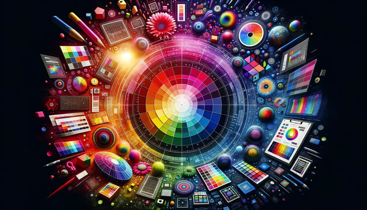
Understanding the Basics of Color Theory
Colors significantly impact web design by creating harmony or chaos. The color wheel is a key tool, featuring primary, secondary, and tertiary colors. Primary colors (red, blue, yellow) create secondary colors (green, orange, purple) when mixed. Tertiary colors emerge from combining primary and adjacent secondary hues.
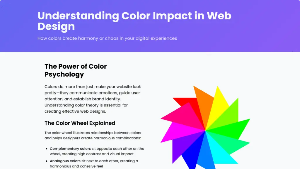
The color wheel helps examine relationships between colors, showing how they complement or contrast each other. Hue refers to the pure form of color, saturation determines vibrancy, and value controls lightness or darkness.
These elements form the foundation for color harmony in web design. Understanding these basics equips designers to craft coherent visual stories across platforms, whether to evoke emotion, prompt action, or delight the eye.
Color Harmony and Emotional Impact
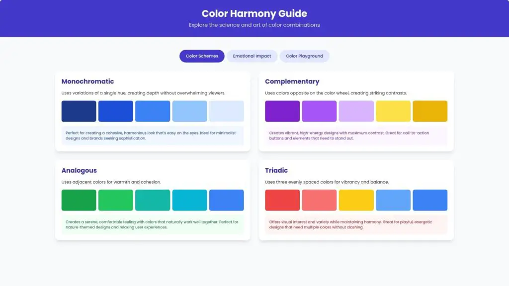
Color harmony principles ensure websites look appealing and connect with users emotionally. Four classic schemes are:
- Monochromatic: Uses variations of a single hue, creating depth without overwhelming viewers.
- Complementary: Uses colors opposite on the color wheel, creating striking contrasts.
- Analogous: Uses adjacent colors for warmth and cohesion.
- Triadic: Uses three evenly spaced colors for vibrancy and balance.
Colors also have emotional impacts:
- Reds might evoke passion or urgency
- Blues calm and reassure
- Greens suggest growth and stability
- Purples convey luxury and creativity
By blending science and art, designers can create web designs that look good and feel right, fostering memorable experiences aligned with brand essence.
Applying Color Theory in Web Design
Applying color theory in web design involves crafting a cohesive user experience that communicates brand identity. Recognizable brands use color strategically to foster strong associations and connections with their audience.
Accessibility is crucial, ensuring sufficient color contrast for readability, particularly for text and interactive elements. Subtle color choices can guide users through a site, enhancing the overall experience.
Selecting a color palette that resonates with the audience requires understanding their preferences and expectations. User testing can provide valuable feedback on emotional responses and interface usability.
Digital tools like Adobe Color or Paletton help in the experimentation phase, providing real-time color harmonies. Designers should consider the context in which their website will be viewed and adjust brightness and saturation levels accordingly.
By skillfully applying color theory, designers can create visually appealing sites that enhance usability, accessibility, and convey brand stories effectively.
Cultural Considerations in Color Use
Cultural perceptions of color vary widely, making it essential for web designers to understand these differences when crafting globally appealing designs. Colors can evoke different responses depending on cultural contexts, presenting challenges for designers working on international platforms.
For example, red symbolizes luck and celebration in many Asian cultures but can represent danger or urgency in Western cultures. White represents purity in the West but is associated with mourning in some Eastern cultures.
To address these differences:
- Conduct thorough research on target audience cultural backgrounds.
- Consider flexible color schemes for regional adaptations.
- Engage local designers or cultural consultants for insights.
- Use A/B testing to gauge audience reactions to color choices.
- Focus on color harmony and balance for universal appeal.
- Remain adaptable to pivot if color choices cause negative connotations.
By leveraging cultural insights and maintaining aesthetic cohesion, designers can create web designs that resonate globally, ensuring visual storytelling is respectful and impactful across borders.
Tools and Techniques for Choosing Colors
Digital tools are valuable for creating captivating color schemes in web design. Popular options include:
- Adobe Color: Allows extraction of color palettes from images and facilitates collaboration with other designers.
- Coolors: Offers quick, randomly generated palettes and precise control with HEX codes.
- Color Hunt: Curates trendy to timeless palettes, highlighted through user votes.
- Paletton: Provides hands-on control with adjustable tints and shades for detailed experimentation.
To effectively use these tools:
- Start with a clear vision of the project’s emotional and thematic tone.
- Use Adobe Color to extract palettes from images that capture the desired mood.
- Employ Coolors for rapid prototyping and iteration.
- Combine palettes with digital mockup tools to simulate user engagement in different contexts.
These tools bridge the gap between theoretical color harmony and practical application, allowing designers to focus on user interaction nuances. The goal is to create colors that communicate, engage, and linger in memory, ensuring each design is visually appealing and strategically aligned with its intended purpose.
Color choices in web design shape user experiences and brand perceptions. Thoughtful selection of hues that resonate with your audience creates an engaging and memorable digital presence.
connect whatsapp- +919165254009
- Color.com. The Impact of Color in Healthcare Design. 2021.
- Journal of Consumer Research. Color Psychology in Brand Marketing. 2020.
- LexisNexis. Color Choices in Legal Web Design. 2019.
- Institute for Color Research. Color Impact on Product Assessment. 2018.

Arsalan Malik is a passionate Software Engineer and the Founder of Makemychance.com. A proud CDAC-qualified developer, Arsalan specializes in full-stack web development, with expertise in technologies like Node.js, PHP, WordPress, React, and modern CSS frameworks.
He actively shares his knowledge and insights with the developer community on platforms like Dev.to and engages with professionals worldwide through LinkedIn.
Arsalan believes in building real-world projects that not only solve problems but also educate and empower users. His mission is to make technology simple, accessible, and impactful for everyone.
Join us on dev community