|
Getting your Trinity Audio player ready... |
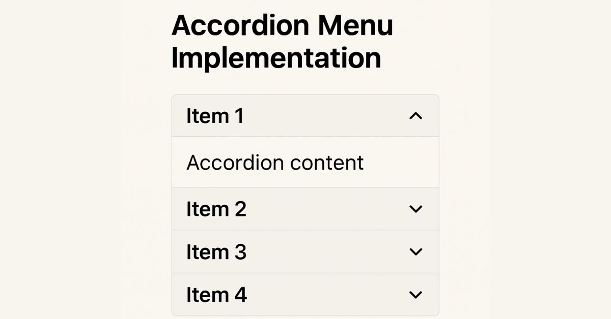
Accordion menus are a popular UI component, which allows users to toggle between hiding and displaying content sections. They are ideal for organizing information in a compact, user-friendly manner, making them a staple for FAQs, mobile navigation, and settings panels. This guide explores implementing an accessible and responsive accordion menu using HTML, CSS, and JavaScript.
1. HTML Structure
Start by creating a semantic HTML structure. Each accordion item should include a header (button) and a collapsible panel.
<div class="accordion">
  <!-- Accordion Item 1 -->
  <div class="accordion-item">
    <h3 class="accordion-header">
      <button class="accordion-button"
              aria-expanded="false"
              aria-controls="panel1">
        Section 1
      </button>
    </h3>
    <div id="panel1"
         class="accordion-panel"
         role="region">
      <p>Content for section 1.</p>
    </div>
  </div>

  <!-- Additional items -->
</div>- Semantic Tags: Use
<button>for interactivity and<div>/<h3>for structure. - ARIA Attributes:
aria-expanded: Indicates if the panel is open.aria-controls: Links the button to its panel.role="region": Identifies the panel as a landmark region.
2. CSS Styling
Style the accordion for visual appeal and smooth transitions.
.accordion-item {
  border: 1px solid #ddd;
  margin-bottom: 8px;
  border-radius: 4px;
}

.accordion-button {
  width: 100%;
  padding: 16px;
  text-align: left;
  background: #f5f5f5;
  border: none;
  cursor: pointer;
  transition: background 0.3s;
}

.accordion-button:hover {
  background: #e0e0e0;
}

.accordion-button[aria-expanded="true"] {
  background: #007bff;
  color: white;
}

.accordion-panel {
  max-height: 0;
  overflow: hidden;
  transition: max-height 0.3s ease-out;
  padding: 0 16px;
}

.accordion-panel.active {
  max-height: 1000px; /* Adjust based on content */
  padding: 16px;
}- Transitions: Animate
max-heightto simulate sliding. - Accessibility: Highlight the active button using
aria-expanded.
3. JavaScript Interactions
Add interactivity to toggle panels and manage state.
document.querySelectorAll('.accordion-button').forEach(button => {
  button.addEventListener('click', () => {
    const panel = document.getElementById(button.getAttribute('aria-controls'));
    const isExpanded = button.getAttribute('aria-expanded') === 'true';

    // Toggle current panel
    button.setAttribute('aria-expanded', !isExpanded);
    panel.classList.toggle('active');

    // Close other panels (for single-open accordions)
    if (!isExpanded) {
      document.querySelectorAll('.accordion-button').forEach(otherButton => {
        if (otherButton !== button) {
          otherButton.setAttribute('aria-expanded', 'false');
          document.getElementById(otherButton.getAttribute('aria-controls'))
            .classList.remove('active');
        }
      });
    }
  });
});- Single vs. Multi-Open: The example closes other panels when a new one opens. Remove this block to allow multiple panels open.
- Animation: CSS handles transitions via the
activeclass.
4. Accessibility Considerations
Ensure the accordion works for all users:
- Keyboard Navigation: Buttons are focusable with
Taband activated viaEnter/Space. - Screen Readers: ARIA attributes announce the state (expanded/collapsed).
- Testing: Validate using tools like WAVE or NVDA screen reader.
5. Best Practices
- Responsive Design: Ensure panels adapt to mobile screens (e.g., use media queries).
- Performance: Avoid excessive content in panels to prevent layout shifts.
- SEO: Hide non-critical content; search engines may de-prioritize collapsed text.
- Touch Targets: Make buttons at least 48px tall for mobile usability.
- Icons: Add ➕/➖ icons to indicate state visually.
Alternative Approach: <details> Element
For simpler implementations, use the native HTML <details> element (limited browser customization):
<details>
  <summary>Section 1</summary>
  <p>Content for section 1.</p>
</details>
Conclusion
Accordion menus enhance UX by organizing content into digestible sections. By combining semantic HTML, CSS transitions, and JavaScript for interactivity, you can create an accessible and visually appealing component. Always prioritize accessibility and test across devices to ensure seamless functionality.

Arsalan Malik is a passionate Software Engineer and the Founder of Makemychance.com. A proud CDAC-qualified developer, Arsalan specializes in full-stack web development, with expertise in technologies like Node.js, PHP, WordPress, React, and modern CSS frameworks.
He actively shares his knowledge and insights with the developer community on platforms like Dev.to and engages with professionals worldwide through LinkedIn.
Arsalan believes in building real-world projects that not only solve problems but also educate and empower users. His mission is to make technology simple, accessible, and impactful for everyone.
Join us on dev community